

October 27, 2014
January 3, 2011
2011: Come Out Swinging!
It's been a while since I last posted on here (I had the busiest fall of my career to date). I want to start off this year's first post, summarizing my journey over the past 13 months.
Over the last 13 months, I...
- Shot my first, second, and third solo weddings
- Landed my first commercial shoot
- Dedicated myself to learning off-camera lighting
- Committed to developing and creating my personal photographic style
- Started this blog, in an attempt to give back to the photography community
- Began to take Facebook seriously so I could connect with more of you
- Started a Twitter account, again to further connect with the Photography community
- Traveled over 5,000 miles shooting various events for one client
- Had work published in several newspapers from Washington state to North Carolina
- Had some of my work incorporated into a television show on the Outdoor Channel
- Started a new company called Restored Film (more on that as the year continues)
- And added over 30 new images to my portfolio on my Website
August 26, 2010
Keith m's Image Critique. . .
Alright let get back into the swing of things with another image critique. If you’re new to the blog, read the first few paragraph's on THIS post to see where I’m coming from concerning these image critiques.
Today’s image has been sent to us by Keith. Thanks, Keith, for being patient over the last several weeks while I was, **cough cough**, absent from posting. Okay, lets get into it…
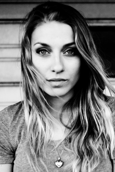
First off, lets talk about the composition. It’s a well done headshot. Following the “rule of thirds,” the subject’s eyes are positioned on the top third of the frame. I really like the movement of the subject’s hair – very natural. The background is pretty good. I might have moved the subject a little to the left, getting rid of the black void tot the right of her head. But its not too bad; a mere nit-pick really. The lighting is well handled, and exposure is spot on.
There are a couple of aspects of this image that I think are simply golden. You absolutely nailed the subject’s expression. I love the pleasant eyes, the slightly open mouth – the entire expression is great. The eyes are perfectly engaged with the camera. The eyes are the single most important part of any portrait, especially a headshot, and even more so when they are looking into the camera. And you nailed it! If the eyes aren’t engaged, then you’ve lost it. Think of it this way, lets say you had this exact image, only the eyes were at mid-blink. The shot would be ruined. As the old saying goes, “the eyes have it” (or something like that). The expression and the eyes are what make this such a strong image. Nicely done.
Now lets discuss how the image might improve. As photographers, we should continually be stretching ourselves, looking for ways to improve what we create. So what could you do next time to improve on this image? I’ve already mentioned my nit-pick about the background, so I won’t go over that again. But the most distracting part about this image to me, oddly enough, also has to do with the subject’s eyes/face. They simply aren’t sharp. Now, depending on what you were going for, its not necessarily “bad.” The face/eyes have that sort of old-time, high-ISO film look. Remember when you’d shoot ISO 1600 or 3200 film, and the detail simply wasn’t there? No? Well trust me. When you shoot 3200 speed film, it lacks detail, no matter how dead-on your focus was. If that’s the look you were going for then great. Great except for one problem. As you look down the frame, you’ll notice the subject’s hair, shirt, and necklace all have more detail than her eyes/face. So, if you’re going for that look, creating it in post-production, then don’t forget the rest of the image.
On the other hand, if you weren’t going for that old-time film look, then the face and eyes simply need to have more detail. Though the “old-time” film look is nice, I would like to have seen sharper details in the face. I’m not sure what caused it, but again, compared to the shirt/hair/necklace area, the face leaves something to be desired. Is it horrible? No, not at all. In fact, its somewhat acceptable in my opinion. But, since we’re committed to our craft, actively looking for things on which to improve, then this is one area of this image we can look at and learn from. Actively scrutinizing our work, helps us hone our skills.
Overall, Keith, I think this is a well done portrait. A few minor tweaks, and you’d have a shoe-in for your portfolio.
Now a reminder to all of us, myself included. Getting out from under the keyboard, picking up our cameras, getting out there and shooting, messing things up, and evaluating what we create is the single best thing we can do to improve. Remember, YOU are the single most important aspect of your craft. Not your gear. Not your subject. Not your settings. Not your location. Not even your skill level. Its YOU. So have some fun, get YOURSELF out there and make YOURSELF better.
As always, in an attempt to improve the photography community at large, please feel free to post a comment and offer some constructive criticism. We all see things differently, and I am by no means the final authority on anyone’s work. See something different? Post a comment. Disagree with me? Post a comment. We’re in this together. Lets help each other out.
Alright, enough is enough,
now, go out and shoot something!
August 20, 2010
Welcome Back, Kotter...
For those of you who have no idea what the title is all about, click HERE or HERE (and realize how old I am). But I digress...
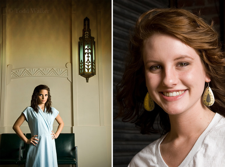
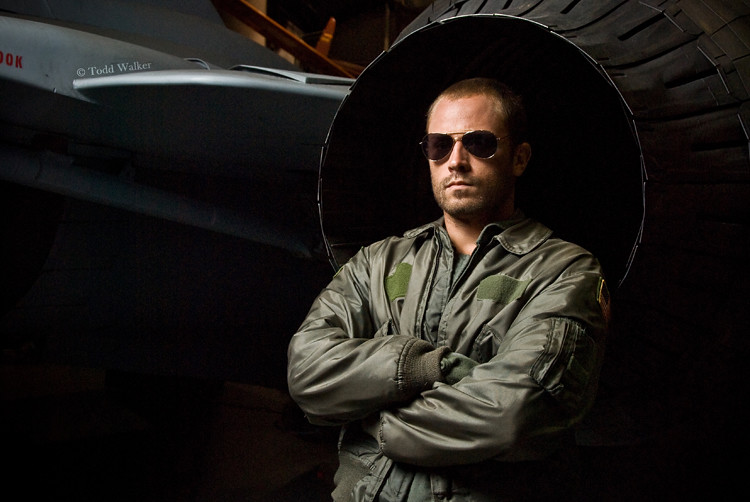
Its been a while, so I thought I rev up with a post showing a small portion of what I've been up to since last time. Below are some shots I've taken the time to resize and post on the blog. I've also been working completely revamping my website, which I'll be launching soon. Next week I'll be critiquing a photo from Keith. After that, I hope to get back to posting much more consistently than the last couple of months. So stay tuned, and as always, if you have any questions about the world of photography, please contact me. If you're new to the blog, feel free to take a look around and make yourself at home. My sole purpose in maintaining this blog is to offer what little I have to better the photography community as a whole. If you're interested in where I'm coming from, read THIS POST.
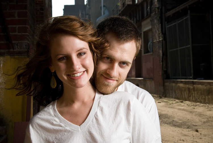
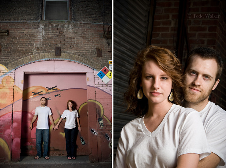
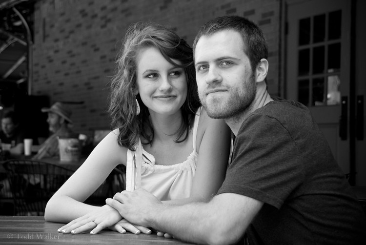
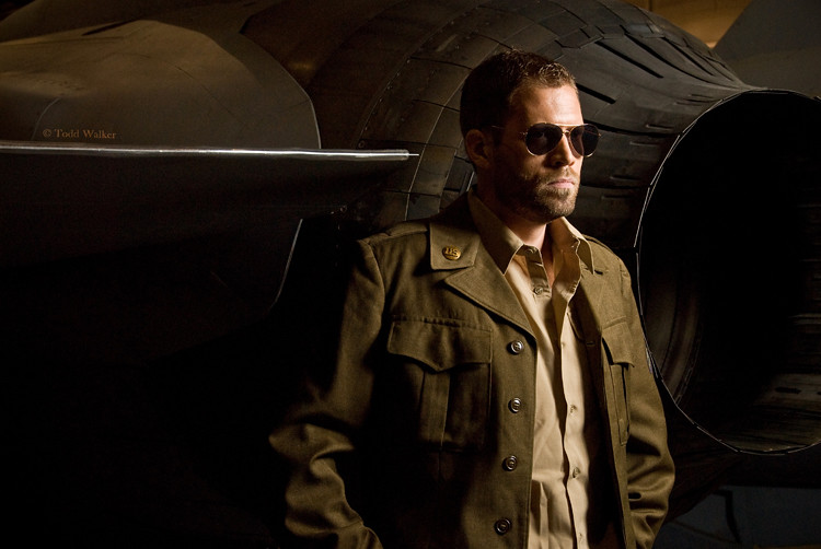
Here's some recent work, starting with a few more from Laura & Joel's engagement session (who's wedding I'm stoked to be shooting next month!), then a few from the Tusla Air and Space Museum:

Now, go out and shoot something!
June 26, 2010
Laura & Joel: a sneak peek...
Here's a sneak peek at Laura & Joel's engagement portraits. We had a great time this morning all over Kansas City. We started around 8:30 and shot for over 3.5 hours. And, as you can see, it was well worht the time we spent.
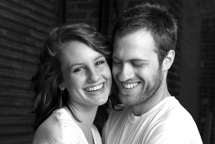
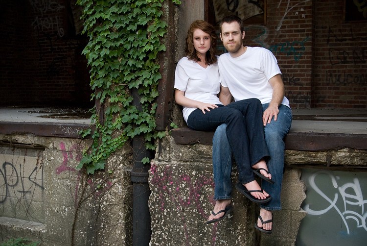


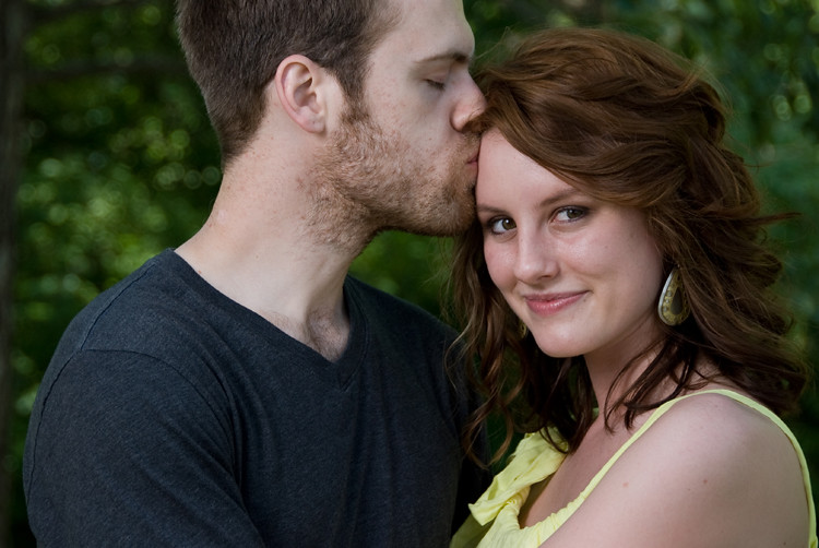
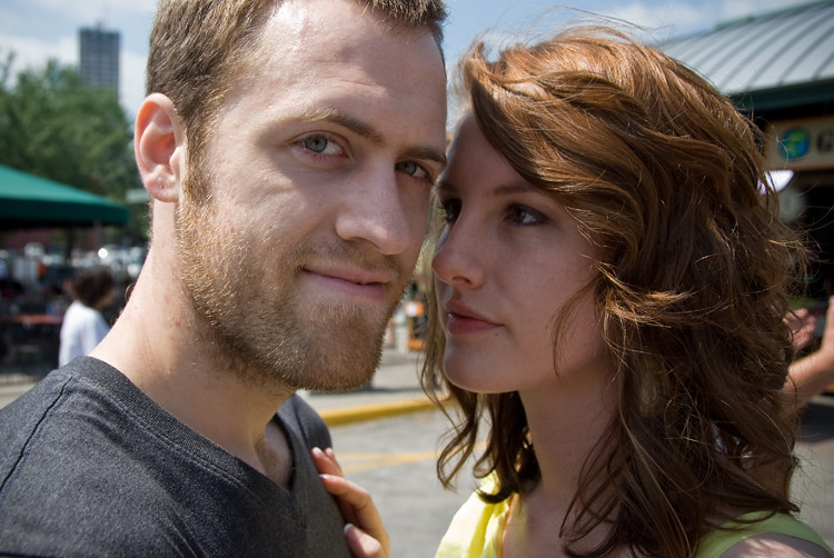
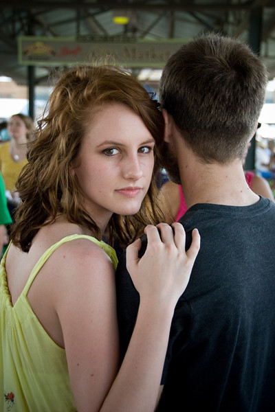
Congratulations you two! I can't wait to photograph your wedding!
Congratulations you two! I can't wait to photograph your wedding!
May 25, 2010
Stacy F's Image Critique...
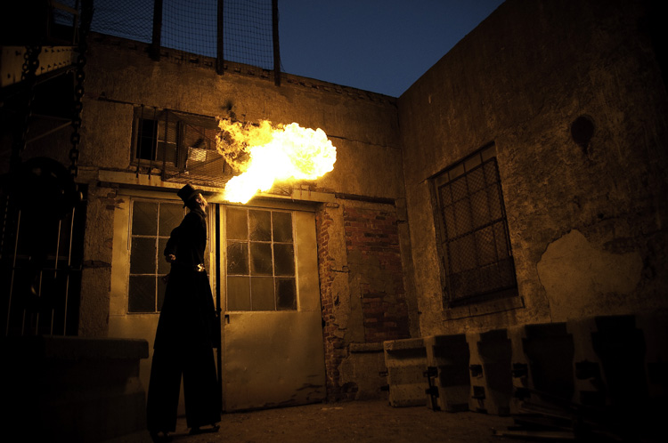
Hello everyone. Here we go with this week’s image critique. This one comes to us again from Stacy F. She sends us a shot of a fire-breathing, stilt-walking, back-alley dwelling, guy. So lets get to it…
Fist off, this image is very striking, very interesting. Immediately, I was drawn into the image, to figure out what’s going on. Nothing like an abnormally tall man spewing fire from his mouth to peak one’s interest. Love it. One thing that will always raise impact level is to shoot subjects seldom seen. I can tell you, with absolute certainty, the number of times I’ve seen a photograph of a guy on stilts breathing fire – three (counting this one). If it were a shot of, say, a squirrel at the park, then it’d be much harder to hold my attention (I saw enough squirrel photos the first week of photog school alone to last me a lifetime). So just by having such an interesting subject you’ve started off with a huge plus. And then there’s the scene. The creepy, decaying, dead-end alleyway is a great place to place your subject. It really gives it that “I’m-lost-and-went-the-wrong-way-down-a-dead-end-alleyway-and-there’s-bars-on-the-windows-and-a-creepy-fire-breathing-carney-in-the-shadows” vibe. It really works with your subject.
The exposure of the image is very well done. You have handled your flash very well. Wait…What? Flash?? That’s right. It may not have as short of a flash duration as, say, an SB-900, but the fire is acting as a flash, illuminating the entire scene. And you’ve exposed for it quite well. You were even able to underexpose the sky by a couple of stops or so, keeping it a dark, rich blue, which is very suitable to the overall image. I also love how the fire creates so much contrast and deep shadows.
Lets talk composition. Here’s where the image could use a little work. The position of the scene is placed nicely within the frame. The angle of the walls framing the sky, the dark shadows to the left and bottom right. So kudos for the composition of the scene. The placement of your subject could use a little work though. As is, its not too bad. But I think if you were to have placed him further into the corner, turned him 180° (facing to the left) and had him blowing the fire towards the left (at the same upward angle), it would have been a stronger image. That would anchor him in the middle of all those great leading lines the building is creating. We could also see his face, which would add some interest as well. Whenever I'm on a shoot like this, I’ll shoot my subject from several different angles and positions, exploring as many options as possible. And maybe you did that. But for this image, a little moving of the image would make it a bit more powerful.
Overall, I really like this image. It has a lot of interesting components. And there’s really only minimal tweaks that I think would help it out. Nicely done Stacy. Keep up the great work!
Now, go out and shoot something!
Subscribe to:
Posts (Atom)