
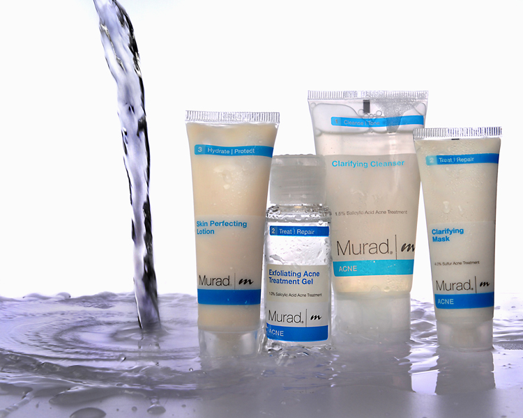
Today’s image up for discussion comes to us from Stacy F. The photo above was shot for an advertising assignment she recently had in school. She said she had gotten some negative feedback about the lighting, sharpness, etc., but nothing that helped her pin down what this image might be lacking. So she’s asking for help.
First off, lets talk about commercial photography. It’s a beast. I’ve known photographers to take several days, tens of thousands of dollars, and multi-person crews just to get one product shot. Commercial photography is not for the faint of heart. Advertising is big business and big bucks. And if a company s going to shell out the money for an image, they require perfection. So, anytime we take on a commercial advertising job, we have to be thinking perfection, lofty a goal as that may seem. I tip my hat to commercial photographers. They do some amazing stuff.
So, lets first take a look at Stacy’s composition. Most of the time you will need to include space in your image for type. The overall composition is pretty well done, and you’ve done a fair job of leaving enough room on the left side and at top for some wording. The position of the poured water is a little off. something about it draws my eye away from the product (which is the opposite of what you want). Of course there are a million and one ways to set this shot up, but perhaps you could have the water come down right smack in the middle of the frame, with the product arranged tightly on both sides. Leave a little dead space on both sides for copy. Then everything would be right there, centered, in your face. You might also either move the “horizon” line wither down (eliminating un-needed extra stuff at the bottom), or up (eliminating the un-needed void at the top). Eliminating the void at top would put more focus on the effect the water has in the foreground, which would be good, since it would allude to the essence of the product (not to mention the point of your assignment).
As far as the lighting goes… its pretty good overall. The reason I think you may have gotten some negative feedback is the image lacks a bit of punch. The background is nice , even, and pure white. The product is pretty well lit, but could use a bit more light. It seems a bit on the muddy (dark) side. Not terribly dark, but enough to notice. And the foreground is too under-lit. You have a decent amount of texture and contrast on the water between the bottles to the right. But the water in the middle and to the left really needs to have the same amount of “pop” as that on the right side. And the way we show texture (even the texture of water), is by cross (or side) lighting. The reason the water on the right pops so well is the light from your BG is giving it the proper amount of cross lighting. In the middle, the BG is being blocked by the product and you loose the cross lighting. Same goes for the left side, it lack pop. I’m not sure your lighting setup here, but if you would have had a large light source to the front and camera right of the product. This may have added jut enough pop to the product, and given a good amount of cross light to the water. If not enough cross light, you could then add a another light with a snoot aimed directly across the water. This is definitely a trial and error type of shot. It would likely take several tries to get everything just right.
As for the sharpness, overall it seems okay. But remember, we’re aiming for perfection here. And your sharpness isn’t perfect. It could be that the water caused the bottles to shift a bit during exposure. Maybe a little more sharpening in post production is all you’d need. But at any rate, you need tack sharp detail top-to-bottom, left-to-right. The pouring water is also fuzzy, obviously because its moving. But I’m surprised you weren’t able to freeze it better. I think that is what causes the viewer to emphasize the softness of the image. The water is fuzzy, and then I look at the product, and notice their not spot on either. Maybe if you’d been able to truly freeze the water’s movement, the rest wouldn’t be as apparent. And, if you were to freeze the water’s movement, if the bottles moved due to the water, they would have been truly frozen as well. I’d be interested to know exactly how you set this shot up. I’m wondering if you used flash, if you also had bright ambient lights on in the room. Then, even though the flash froze the action, a slow shutter may have caught enough ambient light to blur the water and a moving bottle or two. I just don’t know…
Overall though, I think this shot is pretty well done. I think to make it really excel, you only need to tidy up a few things. You’ve heard me say it before, and you’ll hear me say it from here on out. Slow down, think it through, set it up, take the shot. Most of the time, the difference between a great shot and a pretty good shot is simply slowing down and thinking about it more. I beat this drum so much because I need to make it my habit as well.
Thanks Stacy for sharing your shot with us. Keep up the good work!
Now, go out and shoot something!
I like the idea behind the shot and agree with what Todd said. As for the composition though, I would have the product on the left and the pouring water come from the right (because we read left-to-right and the first thing you want the viewer to see is the product [unless the subject has enough impact to it that you want it to be the last thing the viewer sees] but this subject of bottles of products isn't exciting enough for that type of impact, you might want the viewer to see the product...move on to the pouring water...and then go back to the subject on the left instead of starting with the water and moving on to the (somewhat) bland subject and then moving their eyes outside the frame). As for the focus...tabletop photography should always be in sharp focus. I know that it can sometimes be difficult but even with moving bottles (that we don't see the bottoms of) you could stabalize them somehow to keep them still during the exposure. For the lighting, I think it can be summed up with one word...'highlights'. Like Todd said, the best part of the water is where the highlights are. And if we could see some highlights going down the bottles, we would be able to see the shape/form of the bottles much better. A lot of words just for some minor changes...haha Like I said, I like the concept of the image and the execution is almost there. Good job
ReplyDeleteI agree with everything you all have said, and I greatly apprecitate it. :) Todd was asking what my lighting was... There was no ambient light. I had three lights. One underneath the table to light the background, one to the left side of the image to light the water, and another directly behind me. My main light was the one on the left side. I think most of my mistake was not having enough light so create a fast enough shutter speed. Thank you Stephen for the idea of tacking down the bottles, for some reason I didn't think of that. If you have any ideas on how I could have set up my lights better please enlighten me. :) Again, I apreciate all of your thoughts! I will be reshooting this again as soon as I get new bottles so hopefully I can improve it!
ReplyDeleteA light close to the bottles would add a specular on them (for this subject, I would go with a softer specular) that would add dimension to the bottles. This light doesn't have to light anything on your set but just the bottles and can even be just entirely for the purpose of the highlights. When you tack down your bottles, make sure they are all straight...not on a curved/angled area of the plexiglass sweep. Another thing I would try is to already have enough water on the sweep before you shoot that we don't see the table underneath in the foreground like we do in your first shot. Good luck with the reshoot...would like to see how it turns out!
ReplyDeleteAside from all the technical things that have been pointed out, my biggest concern with the image is that it does not highlight the assignment, which as I understood from the photographer, was "pouring."
ReplyDeleteOur eye isn't guided thoroughly. The only motion we have is from the pouring water which goes straight down. After that, we're left to examine the bottles with our eye going up, down, up down to each one as their sizes vary. After that, there's nothing very pulling about the image. Our eye goes on a roller coaster ride and then there's nothing for us to examine. It's a very good idea, but just needs a bit more work in execution!