Alright let get back into the swing of things with another image critique. If you’re new to the blog, read the first few paragraph's on THIS post to see where I’m coming from concerning these image critiques.
Today’s image has been sent to us by Keith. Thanks, Keith, for being patient over the last several weeks while I was, **cough cough**, absent from posting. Okay, lets get into it…
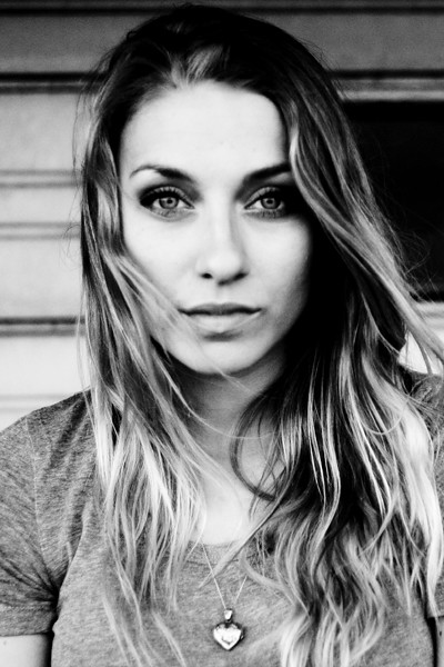
First off, lets talk about the composition. It’s a well done headshot. Following the “rule of thirds,” the subject’s eyes are positioned on the top third of the frame. I really like the movement of the subject’s hair – very natural. The background is pretty good. I might have moved the subject a little to the left, getting rid of the black void tot the right of her head. But its not too bad; a mere nit-pick really. The lighting is well handled, and exposure is spot on.
There are a couple of aspects of this image that I think are simply golden. You absolutely nailed the subject’s expression. I love the pleasant eyes, the slightly open mouth – the entire expression is great. The eyes are perfectly engaged with the camera. The eyes are the single most important part of any portrait, especially a headshot, and even more so when they are looking into the camera. And you nailed it! If the eyes aren’t engaged, then you’ve lost it. Think of it this way, lets say you had this exact image, only the eyes were at mid-blink. The shot would be ruined. As the old saying goes, “the eyes have it” (or something like that). The expression and the eyes are what make this such a strong image. Nicely done.
Now lets discuss how the image might improve. As photographers, we should continually be stretching ourselves, looking for ways to improve what we create. So what could you do next time to improve on this image? I’ve already mentioned my nit-pick about the background, so I won’t go over that again. But the most distracting part about this image to me, oddly enough, also has to do with the subject’s eyes/face. They simply aren’t sharp. Now, depending on what you were going for, its not necessarily “bad.” The face/eyes have that sort of old-time, high-ISO film look. Remember when you’d shoot ISO 1600 or 3200 film, and the detail simply wasn’t there? No? Well trust me. When you shoot 3200 speed film, it lacks detail, no matter how dead-on your focus was. If that’s the look you were going for then great. Great except for one problem. As you look down the frame, you’ll notice the subject’s hair, shirt, and necklace all have more detail than her eyes/face. So, if you’re going for that look, creating it in post-production, then don’t forget the rest of the image.
On the other hand, if you weren’t going for that old-time film look, then the face and eyes simply need to have more detail. Though the “old-time” film look is nice, I would like to have seen sharper details in the face. I’m not sure what caused it, but again, compared to the shirt/hair/necklace area, the face leaves something to be desired. Is it horrible? No, not at all. In fact, its somewhat acceptable in my opinion. But, since we’re committed to our craft, actively looking for things on which to improve, then this is one area of this image we can look at and learn from. Actively scrutinizing our work, helps us hone our skills.
Overall, Keith, I think this is a well done portrait. A few minor tweaks, and you’d have a shoe-in for your portfolio.
Now a reminder to all of us, myself included. Getting out from under the keyboard, picking up our cameras, getting out there and shooting, messing things up, and evaluating what we create is the single best thing we can do to improve. Remember, YOU are the single most important aspect of your craft. Not your gear. Not your subject. Not your settings. Not your location. Not even your skill level. Its YOU. So have some fun, get YOURSELF out there and make YOURSELF better.
As always, in an attempt to improve the photography community at large, please feel free to post a comment and offer some constructive criticism. We all see things differently, and I am by no means the final authority on anyone’s work. See something different? Post a comment. Disagree with me? Post a comment. We’re in this together. Lets help each other out.
Alright, enough is enough,
now, go out and shoot something!

