February 28, 2010

Stephen S's Image Critique

© Stephen Smith

This week’s image up for discussion comes from Stephen S. (known as “Sleven,” back in photogin’ school). His image is of a guy smoking a cigarette, the smoke of which creates a skull and crossbones.

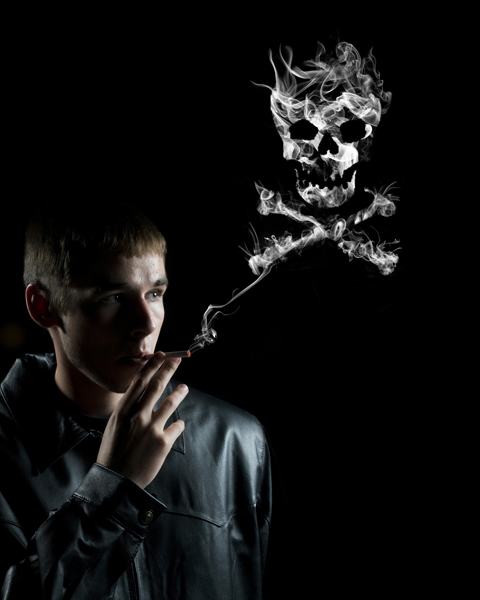
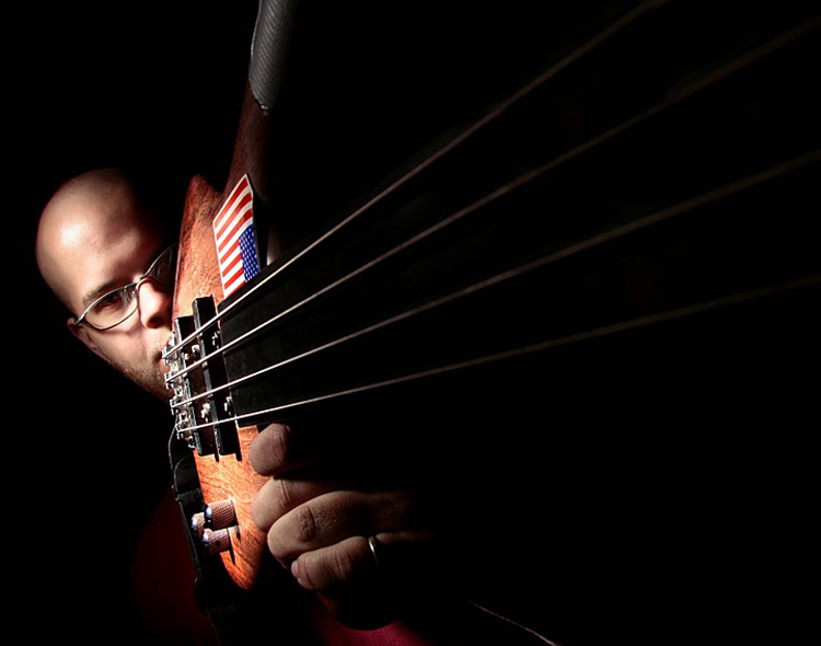
My first reaction was, “wow, that’s a great image.” The image does exactly what its supposed to do: invoke a reaction. Its sharp, well lit, and well composed. The editorial style properly uses dead space which is suitable for text. The deep lighting ratio allows our eye to naturally lead away from the guy to the smoke, which is the real subject of the image. And speaking of the smoke, overall, its simply sick - such a good graphic! A ton of PS work I’m sure, but it was worth it. It paid off.

There are a couple of areas I see that could be improved. These are highly trivial at best. The first thing is the skull formed in the smoke. Let me preface this by saying this is nit-picky, and 99.99% of people would never see it. In fact, people reading this post won’t be able to see it because the image is so small. But when I zoom in to the skull, the edges in the eyes, nose and mouth, are a little too choppy, a little too ridged. The rest of the skull is so well done. The smoke looks very natural and wispy. But these areas look like they’ve been erased with the eraser tool in PS. Nit-picky for sure, but these edges aren’t consistent with the rest of the skull. Looking at the top of the skull and most of the crossbones, the edges look awesome. They look like wispy smoke, but are still well defined. Maybe instead of erasing the edges in question, you could replicate the areas that are so well done. Or, instead of erasing, maybe you could apply some heavy burning (no pun intended). This might give you the same effect, but without the abrupt deletion of the smoke. But again, this is highly trivial. Just an exercise in trying to improve, even when there is little room for improvement.

The second thing I think would help the image just a tad, would be to add a hair light. It kinda bugs me that the dude’s head disappears into oblivion. I think it would help visually replicate the skull and crossbones. Doing so would better tie the guy’s head and the skull together - showing what’s gonna’ happen to him if he keeps smoking.

Those are two very small things that could be improved upon. As is, the image is quite good. Nicely done Sleven! Thanks for sending it in! Keep doing what you’re doing. On second thought, don’t keep doing what you’re doing – strive to get even better!!

Anyone have anything else to say about Stephen’s photo? Feel free to post a comment and chime in! But, as always, be respectful of your fellow photog. Any ignorant or unhelpful comments will be removed and your hard drive will crash. Okay, maybe not, but it made you think didn’t it? =)

To everyone else out there reading this:: If you are interested in having your image(s) critiqued, you can email them to toddwalkerphotography@gmail.com. Large files please, I'll resize them myself (and I promise not to use them for anything other than the one blog post). Put “Critique” in the subject line. I take these very seriously, and vow to give you an honest, worthwhile assessment of your images. My goal is to improve our craft as a whole. I’d love to see your stuff, and try my best to help you improve.

Now, go out and shoot something!

February 27, 2010

Your Questions Answered...

© Todd Walker

The other day I was talking with a couple of photog friends of mine. One of them said, “hey, you should explain lighting ratios on your blog.” As we dove into the topic, I quickly realized how far removed I have become from text book, school-learnin’ photography. One of them is currently in photo school, and the other is fresh out of photo school. Topics like lighting ratios are fresh in their minds. Not so much in mine. They sort of ate my lunch on the topic.

Understanding lighting ratios can be very useful. They tell us how deep the shadows will be in a photograph. Different ratios communicate differently. Its a tough subject to both explain and to grasp. But I thought its a great topic for a post. So, I whipped out the ‘ol light meter, oiled the cogs in my brain, and went to work. You may have to read this post a couple of times to get it. But I’ll do my best to ‘slpain it to you.

For this post, I’m assuming you already understand f-stops and exposure, and how to use a light meter. I won’t go into all of that. But if you have any questions, feel free to leave a question in the comment section of this post, and you are always welcome to email me at todd@toddwalkerphotography.com.

To explain how to calculate lighting ratios, we’ll be using a basic two-light portrait set up – main light positioned camera right and fill light positioned behind the camera. It looks like this:
© Todd Walker

Let’s start by setting the Fill Light to f/5.6. By itself it would look like this:
© Todd Walker
This will give a reading of f/5.6 across the subject’s face. This would be a 1:1 ratio – both sides of the face will have the same amount of light. If we shot a picture with this one light, we’d set our camera’s aperture to f/5.6, take the shot and be done. Our lighting would be okay, but fairly flat since its coming directly from the camera. But we want more a more interesting image. We need to add some dimension to the subject. For that, we’re going to add a brighter light to the right, which will better shape the subject’s face. Soooo…

Let’s set the main light to f/8, which is one stop brighter than the fill. Using both lights together would look like this:

© Todd Walker

It is paramount to understand that each time the amount of light doubles, we’ve gained one stop of light. In other words, light increased by one stop is twice as bright. Two stops would be 4x brighter; three stops would be 8x brighter; four stops would be 16x brighter, and so on. This is key to understanding how to calculate lighting ratios. Our main light is coming from the right side, and not hitting the left side of the face. This ratio would read _:2 (2x brighter than the fill). The right side of the subject’s face already has light hitting it at f/5.6 from the fill light. And since our fill light has a ratio of 1:1, adding a second light that is twice as bright would give us a 1:3 ratio. Got that? 1+0=1 and 1+2=3, thus a 1:3 ratio. Feel free to go over that again =).

There’s a lot of misinformation out there on this subject. A lot of people call this a 1:2 ratio; thinking that since the main light is twice as bright, it simply gives us a 2 on the right side of the ratio. The confusion comes from not accounting for what the fill light will contribute to the right side of the subject. One way to get a 1:2 ratio would be to move the fill light to the left of the camera, so none of its light would hit the right side of the subject. Then, since no light would be contributing to the right side, it would be a simple 1:2 ratio. Another way to get a 1:2 ratio would be to leave the lights where they are, but set the main light to f/5.6, same as the fill. This would increase the amount of light on the right side by one stop (twice as bright). Then it would be a 1:2 ratio. Make sense? Feel free to read that paragraph through a few times as well =).

Back to our 1:3 ratio. . .

Now that we have our lights set up, lets set our camera. In this scenario we would set our aperture for the main light side of the face. Remember, we have to account for BOTH the main light AND the fill light. So, f/8 plus f/5.6 would give us a reading of f/9.5. Say what? Why not set our camera to f/11? Remember, a one stop increase is twice as bright. The main light is f/8. Then we are adding half as much light (f/5.6) to that, thus we get f/9.5. That’s half a stop between f/8 and f/11. Only if both lights were set at f/8 would the brightness be doubled and equal f/11. Since we are adding f/5.6 to f/8, we get f/9.5. So we set our camera to f/9.5. Yes, you can go over that paragraph a few more times as well. Equal sign right parenthesis.

Out on the street, I have developed a tried and true way for getting the proper ratio. I set up the first light and adjust it to the desired f-stop I want to shoot. Then, if the shadows are too dark, I might simply use a reflector to bounce light back into the shadow side of the subject. If that doesn’t do it, I’ll add a second light and adjust it until the shadows are at a level I want. That’s it. I very rarely even think about lighting ratios. I use the LCD and my E-Y-E. The only time I think about them is for cookie-cutter shots (proms, school photos, church directories, etc.). I remember from my schoolin’ days that a 1:1 ratio is flat. 1:3 is safe, suitable for cookie-cutter shots. A 1:5 ratio means drama. And 1:9 is the edge of darkness. For those jobs that require safe, traditional lighting, out comes the ol’ light meter. I set my lights one stop apart. Then bang away on the shutter button.

For example, I recently had a church directory shoot. I threw up a muslin background and a bsic two-light setup, like the one we've been using here. I set my main light to f/8. Then I set my fill light to f/5.6. Thats one stop difference, a 1:3 ratio. I set my aperture to f/9.5 and started to shoot. Setting up took me all of 15 minutes. (would've been 5 minutes had my softbox been more agreeable). Here's a look at the setup ::

© Todd Walker

(The room was so tight, I had to move the fill light over to the left so I could back up enough to take this shot. But I did move it back up and behind the camera).

And here's the boring, but safe and suitable result:

© Todd Walker

Is this the most amazing photo you’ve ever seen? Of course not. I don’t know any photographer who aspires to making church directory images. But they help pay the bills. As artists, we do everything we can to pay the bills. Even the less exciting, less creative assignments. We do what we HAVE to do, so we can do what we WANT to do.


So there you go. Everything you will ever need to know about lighting ratios. Okay, well, maybe not. But it’s a start. It all may seem like an overload. But it isn’t exactly rocket surgery we’re talking about here. And it sure as heck isn’t brain science. It may be difficult to understand, but we aren’t trying to cure heart disease. At the end of the day, we’re just taking pictures. If you’re new to this lighting stuff, don’t be afraid of it. Its just light. It won’t bite. And light that won’t bite is just right =P. We have an incredible amount of creative control when we control our lighting. Understanding lighting ratios is a good thing. But if all this stuff flies over your head, don’t worry. Your camera won’t blow up. Lighting ratios can be a useful tool, but being constrained by them will kill our creativity.

As I said earlier, if you have any questions about this, or anything photography related, please post them in the comment section below. Or feel free to e-mail me at: todd@toddwalkerphotography.com

Now, go out and shoot something!

February 24, 2010

JPEG vs. RAW: Who’s in Charge 'round Here?

© Todd Walker

I run into a lot of photogs who flinch anytime you mention the word “RAW”. The idea of shooting in the RAW format is so foreign, that many don’t even bother learning what it is, much less how to use it. And it shouldn’t be. JPEG and RAW both have their place in a photographer’s arsenal. Either way, we should know the difference between the two, and choose the best format for our personal style of shooting. It isn’t rocket science we’re talking about here. So don’t be scared. Lets take a brief look at the two main formats for recording images.

JPEG and RAW are the two main formats to shoot in. A JPEG is a file format that is very universal. Most software programs, computers, print labs, etc. are able to readily read and use a JPEG. A vast majority of people shoot in this format. And for good reason. When shot in JPEG mode, the camera takes the a large amount of data and applies certain levels of contrast, saturation, color hue, and sharpness to the data. This is determined by which color mode (or style) the camera is set in - known as standard, neutral, portrait, vivid, monochrome etc. Once it applies these levels, the camera then compresses the data into a JPEG file. The CAMERA processes the image. Little else is needed to be done.

A RAW file is just that - raw. Whenever an image is captured in RAW mode, the camera records all the raw data and that’s it. It is unprocessed and uncompressed. The camera has not been allowed to process the data, so you get everything recorded. The size of a RAW file is much larger than a JPEG file. A RAW file is unique to the brand and model of the camera which took the image, and therefore is not universal. Most software programs, computers, print labs, etc. are not able to readily read and use a RAW file. And, you guessed it, a RAW file still needs to be processed. If you shoot in RAW, you will have to apply contrast, saturation, color, sharpness, etc. to the data and convert it to JPEG in a computer in order to be able to use it. You get much more out of a raw file, but you have more work to do after the picture is taken. YOU process the image, not the camera.

So what’s the big deal? There are pros and cons to shooting in either format. Shooting in JPEG gives you the ability to take the image straight out of the camera and print it, email it, look at it on your TV etc. Outside of tweaking it in photoshop, once you’ve shot it, you’re done. The downside however, JPEGs tend to lack the detail and sharpness a RAW file can have. JPEGs also lack dynamic range, meaning they are limited in the amount of detail that can be recorded in the highlights and Shadows. And there is less latitude in correcting exposure and sharpness. Though they are easier to use, JPEGs are limited in image quality.

Raw files give you a ton of usable data to work with. Shooting in RAW allows you to pull the most amount of detail possible out of a file. And you gain a bit more sharpness as well. The dynamic range of a RAW file is huge, allowing you to capture more detail in the highlights and shadows. And the latitude you get can save your backside when your exposure is off. The downside is you have to do some work after shooting. You still have to load them into the computer and process them. But the amount of control you get may be worth it to you. The image quality is far superior to a JPEG.

Once I got over my fears of shooting in RAW and began to learn how to process the files, I quickly saw the advantage of the format. I can get much more out of my camera shooting RAW files. I’m so spoiled on this, I shoot everything in RAW. Even playing around the house with my 19 month old daughter. Now that I know what RAW gives me, I simply no longer like what my camera produces in JPEG. Its kinda like comparing a Lean Cuisine diner to a home made diner using fresh (raw) ingredients. One is easy and ready to go, the other take some time and effort. One is ready to heat up and eat, but the other tastes so much better when you eat it. And besides, after putting in the effort to optimize my post processing workflow, I only spend a minute or two on each image. Sometimes much less than that. I’m aware every camera shoots differently. Some produce better JPEGs than others. But one consensus across the industry is, no matter how good your JPEGs look, you can still get more out of an image from shooting RAW and processing it yourself.

So who wins? Which should you shoot? Well it comes down to a personal decision. I know several pros out there who shoot mainly JPEG. Others, like myself, forget our cameras even offer JPEG, and shoot exclusively in RAW. I also know hobbyists who shoot everything in RAW because of the amount of control it gives them, while others leave it in JPEG. To each his own. But if you aren’t aware of what RAW files are able to give you, or you’re scared to try it out, you owe it to yourself to at least give it a try. To help the transition, I shot RAW + JPEG for a few months. That way every frame I shot, I got a RAW file to learn with, and a JPEG incase I “screwed the thing up.”

Now, go out and shoot something!

February 22, 2010

Stacy F.'s Image Critique

© Stacy Fields

Today’s image up for discussion comes to us from Stacy F. The photo above was shot for an advertising assignment she recently had in school. She said she had gotten some negative feedback about the lighting, sharpness, etc., but nothing that helped her pin down what this image might be lacking. So she’s asking for help.

First off, lets talk about commercial photography. It’s a beast. I’ve known photographers to take several days, tens of thousands of dollars, and multi-person crews just to get one product shot. Commercial photography is not for the faint of heart. Advertising is big business and big bucks. And if a company s going to shell out the money for an image, they require perfection. So, anytime we take on a commercial advertising job, we have to be thinking perfection, lofty a goal as that may seem. I tip my hat to commercial photographers. They do some amazing stuff.

So, lets first take a look at Stacy’s composition. Most of the time you will need to include space in your image for type. The overall composition is pretty well done, and you’ve done a fair job of leaving enough room on the left side and at top for some wording. The position of the poured water is a little off. something about it draws my eye away from the product (which is the opposite of what you want). Of course there are a million and one ways to set this shot up, but perhaps you could have the water come down right smack in the middle of the frame, with the product arranged tightly on both sides. Leave a little dead space on both sides for copy. Then everything would be right there, centered, in your face. You might also either move the “horizon” line wither down (eliminating un-needed extra stuff at the bottom), or up (eliminating the un-needed void at the top). Eliminating the void at top would put more focus on the effect the water has in the foreground, which would be good, since it would allude to the essence of the product (not to mention the point of your assignment).

As far as the lighting goes… its pretty good overall. The reason I think you may have gotten some negative feedback is the image lacks a bit of punch. The background is nice , even, and pure white. The product is pretty well lit, but could use a bit more light. It seems a bit on the muddy (dark) side. Not terribly dark, but enough to notice. And the foreground is too under-lit. You have a decent amount of texture and contrast on the water between the bottles to the right. But the water in the middle and to the left really needs to have the same amount of “pop” as that on the right side. And the way we show texture (even the texture of water), is by cross (or side) lighting. The reason the water on the right pops so well is the light from your BG is giving it the proper amount of cross lighting. In the middle, the BG is being blocked by the product and you loose the cross lighting. Same goes for the left side, it lack pop. I’m not sure your lighting setup here, but if you would have had a large light source to the front and camera right of the product. This may have added jut enough pop to the product, and given a good amount of cross light to the water. If not enough cross light, you could then add a another light with a snoot aimed directly across the water. This is definitely a trial and error type of shot. It would likely take several tries to get everything just right.

As for the sharpness, overall it seems okay. But remember, we’re aiming for perfection here. And your sharpness isn’t perfect. It could be that the water caused the bottles to shift a bit during exposure. Maybe a little more sharpening in post production is all you’d need. But at any rate, you need tack sharp detail top-to-bottom, left-to-right. The pouring water is also fuzzy, obviously because its moving. But I’m surprised you weren’t able to freeze it better. I think that is what causes the viewer to emphasize the softness of the image. The water is fuzzy, and then I look at the product, and notice their not spot on either. Maybe if you’d been able to truly freeze the water’s movement, the rest wouldn’t be as apparent. And, if you were to freeze the water’s movement, if the bottles moved due to the water, they would have been truly frozen as well. I’d be interested to know exactly how you set this shot up. I’m wondering if you used flash, if you also had bright ambient lights on in the room. Then, even though the flash froze the action, a slow shutter may have caught enough ambient light to blur the water and a moving bottle or two. I just don’t know…

Overall though, I think this shot is pretty well done. I think to make it really excel, you only need to tidy up a few things. You’ve heard me say it before, and you’ll hear me say it from here on out. Slow down, think it through, set it up, take the shot. Most of the time, the difference between a great shot and a pretty good shot is simply slowing down and thinking about it more. I beat this drum so much because I need to make it my habit as well.

Thanks Stacy for sharing your shot with us. Keep up the good work!

Now, go out and shoot something!

February 19, 2010

Your Questions Answered...

Today's question is: "Is it better to under expose or over expose an image?" This is a great question. There is a lot of theories buzzing the web saying we should underexpose our shots by a stop or so. Let me begin by saying our supreme goal must be to nail our exposure. In fact, get a good exposure, listen carefully, and you might just hear angels singing.

Back in the slide film days, it was better to underexpose your shots. Though the frame would be a bit dark, you still had detail to work with. But if you overexposed it, the detail was lost. It was therefore common to underexpose your film by a half a stop or so, just to be on the safe side. This practice has carried over into the digital realm.

When shooting with a digital camera (particularly in JPEG), you have a small margin of error, much like slide film. Many photographers, therefore, adopted the practice of underexposing their shots, hoping to play it safe. But here’s the problem…in digital, if an image is underexposed, there are more dark areas in the image. Noise is most prevalent in the shadows. Annnnd if you lighten a dark image, you’ll be lightening the noise in the image. Then, when you get it to the proper exposure, will it look, well, noisy. On the other hand, if you overexpose the image, there is less noise recorded. Then when you darken it, you won’t be adding any noise, and the image will look cleaner. Therefore, if for some reason can’t nail the exposure dead on, and you have the choice, choose to overexpose the image. The end result will be much better. But again, the goal should always be to nail the exposure in camera.

Here’s a fun little exercise. To see the difference, try it out. Shooting in RAW, take two shots of the same scene. In the first, underexpose the shot by a stop or two. Then bring it back up when you process it. You’ll see how the noise in the shadows shows up as you lighten the image. In the second shot, overexpose the image just to the point of blowing out the highlights. Then bring it back down when you process the file. You’ll be amazed how clean your image is.

Now, go out and shoot something!

February 17, 2010

QUALITY OF LIGHT ~ Specular / Defuse

© Todd Walker
Whether you use the sun or a flash, as a photographer, understanding light will be a lifelong pursuit. You could study from sun-up to sun-down everyday till your grandkids have grandkids, and you’d still have a lot to learn about light. Albert Einstein once said he could spend his entire life trying to figure out what light is (loose paraphrase). I'm not an expert on lighting. And there are volumes upon volumes of books written on the subject of lighting. There are plenty of photographers out there who put my lighting skills to shame. But, for the sake of the industry, and for those of you reading this, I’m going to share a little bit of what I know about light. Hopefully you can gain something and be able to use it in your own pursuit of photography.

Without light, there is no photograph. The word itself literally means “light drawing” – “photo”=“light” and “graph”=“drawing”. What separates a great photograph from a mediocre one? The quality of light. The subject in the photograph may help a little, but the true difference will always be lighting. You can take two photographs of the same subject, one poorly lit, and the other well lit. The outcome will be completely different. Same subject, same pose, one looks awesome, and one looks like it needs a courtesy flush. The great Joe McNally says “Light speaks, just like language. You can make someone look like an angel, or the devil.” Light allows you to bring your vision into being. Light is photography. Not Nikon or Canon, not Photoshop or Lightroom, not actions or presets. Burn it into your brain. Photography is light. Light is photography. And recognizing good light will be the single greatest advancement one can have as a photographer. Some have the God-given ability to recognize it. Others have to work hard at learning to see it. And we all would do well to spend our time learning to see and use good light.

So what is good light? Well, good light is . . . relative. That’s right, no silver bullet here. Good light is completely dependant on the vision you have for your subject. Say you want to shoot a beautiful portrait of a woman. You want the shot to be soft, airy, serene. You will never get that shot if you are using is harsh, contrasty light. Or say you envision something edgy, dark, and dramatic. Won’t happen if your light is soft and creamy. We need to understand light. Not megapixels. Not Brands. Not bokah. Lets say it again class: Light is photography. Photography is light.

To understand how to capture our vision, we must first understand a couple of different qualities of light. The first quality of light is known as specular light. Specular light is what gives us high contrast and sharply defined shadows. Its often referred to as harsh light. Specular light comes from a very small light source. Think of a flashlight. If you are in a dark room and turn on a flashlight, you get a lot of contrast and well defined shadows. Another example is the noon-day sun on a clear day. The sun is relatively small, a mere dot in the sky. And from that small light source, you get lots of contrast and crisp black shadows on the sidewalk. To achieve harsh, contrasty light with well defined shadows, you need a specular light source. The light needs to be tiny.

The second quality of light is known as defused light. Defused light is what gives you the creamy light with low contrast and very soft shadows. Its often referred to as soft light. Defused light comes from a very large light source. Think of a picture window. If you are in an otherwise dark room and the daylight comes in though a picture window, you get low contrast and soft shadows. Another example is the noon-day sun on an overcast day. The sun is illuminating the clouds and thus the entire sky is the light source. The light source is relatively huge. And from that light source, it gives very low contrast and extremely soft shadows. To achieve soft creamy light with soft shadows, you need a defused light source. The light needs to be huge.

One thing to mention here is the brightness, or luminance. Brightness has no effect on whether the light is specular or diffused. Think of it this way. In a pitch black room, light a single candle. This is a very small light source. It is also very dim. Now, in the same pitch black room, turn on one of those LED key-chains. You know the ones that have a single LED sticking out so you can see a keyhole better. Its about the same size as a candle flame. But it is much brighter. And both create very high levels of contrast and deep black shadows. Their brightness levels are very different, and they will illuminate a subject to very different degrees. However, since they are both very small, they are very specular in nature. So again, it is the SIZE of the light source that determines specular or diffused light. Not the brightness.

Now, the quality of light ranging between specular and defuse is a sliding scale. Its not an “either/or” option. But knowing the differences between the two extremes is a great place to begin. Say you’re shooting outside on a sunny day. You want the light on your subject to be softer than what the sun is giving you. You know you need to diffuse the light a bit. The sun is a small light source (specular), and to diffuse it you have to make it larger. So how do you make the sun larger? By cheating. A handy thing to have in your bag is a large 5-in-1 reflector. One of the “colors” in the reflector is translucent. You can place this between the sun and your subject. The translucent reflector is illuminated by the sun which now becomes your light source. And the reflector, being much closer to your subject, is relatively much larger than the sun (The bare sun is a small dot, the reflector is several inches across). You have re-created a similar effect to an overcast sky. You now have made the light on your subject softer. It may not be as soft as if it were actually overcast, but it’s a heck of a lot better than direct sunlight. Now, am I saying everyone needs to have a 5-in-1 reflector? Not at all. I’ve used one a total of one time. It simply doesn’t help me achieve my photographic vision. But if it would help you achieve your vision, then by all means, use it. This is simply one scenario and one solution. You get the idea. Have a vision. Assess the situation. Set it up. Press the button.

Today, I have a homework assignment for you. Go to any of the mass photo sharing websites out there (my favorite is www.photo.net). Once you’re there, take some time looking at the type of photos you enjoy. I like portraiture. As you look through them, you’ll come across those that stop you in your tracks. When that happens, don’t just move on. Take the time to study those images. What made you stop and take a longer look? Why do you like it? What type of light did they use? Specular or defused? Then post a comment her on the blog with a link to the image and let us know your thoughts on it.

Now, go out and shoot something!

February 15, 2010

April C's Image Critique

© April Chompunuchtanin

Today’s image up for discussion comes to us from April C. The image above is of a bald guy with a guitar. But its not just any old photo of a bald guy with a guitar. It’s a very well done, editorial style portrait. It has several things going for it, that make it work.

First thing that makes this such a great image is the lighting. The lighting is very fitting for the subject. The lighting is dramatic, with deep shadows, which cut out the entire image. The lighting is also very well controlled. Notice how she concentrated the light on the subject’s face and guitar. From there, the light fades outward. Our eyes naturally go to the brightest area of a photograph. By properly controlling the light, it keeps your eye right where it should be, on the subject.

This image also has a very strong composition. April has done a wonderful job of using dead space, on the right side of the frame. This dark area, along with the guitar strings direct the eye strait to the subject. There are a lot of photogs out there that say its wrong to use dead space. This is only true if you’re going for a very classical portrait, and submitting it for a PPA contest. But this image is anything but classical portraiture. But that’s what makes it so interesting. Its not normal. It has broken the rules. Its outside the box. Its. . . good.

If I were to nit-pick and find something to improve on this image, it would be to add a catch light in the subject’s eye. Now, I realize there is a lot of effort in controlling the light in this shot. It looks like there is only one light being used. It also looks like the light is either shot through a snoot, or a grid spot. And, to use this one light source and get a catch light may completely screw up the lighting of the entire image. So, if you can’t move your light around for this image, you may have to add a second light. This doesn’t need to be much, a small flash at 1/64th power, with a very tight snoot aimed directly at that eye. Some care taken not to catch a reflection in the glasses and you’d have it. Again, this is a very miniscule, nit-picky thing to bring up. It really doesn’t need the catch light, but hey, I had to find something to push the envelope.

As always, this image is now up for comments form anyone who cares to add their opinion, for the betterment of the industry. So, what’d I miss?

Thanks April for subjecting your image to my textual lashings!! You’ve got some great stuff out there, and I’ glad you do what you do! Keep up the good work!

Now, go out and shoot something!

February 10, 2010

Your Questions Answered

© Todd Walker

Time for a “your questions answered” Friday. This week’s question comes from a friend of mine - Garrett D. from Springfield, Mo! I had the honor of shooting his senior photos last year. He’s quite the creative too. You can check out some of his stuff HERE.

The question is, “How do you photograph people?” This is such a great question.

Starting out, your photography may not be at a level you think it should. Then you see someone’s work that you really, really like. So you set out on a quest to shoot just like them. This is a very dangerous venture - for a couple of reasons. First of all, you never get the respect you deserve. Lets say you really admire the style of David Hill. You think his stuff is so sick you cry when you see it. And your work isn’t anything like his. So you decide to put in the effort. You begin to read everything you can about David Hill. You spend hours studying his images trying to gain insight into how he does what he does. You find tons of articles and webisodes explaining the “David Hill” lighting technique. You invest the time to mimic his lighting. After countless months of trial and error, you perfect his post production and photoshop skills. And finally you’ve got it. You have mastered the technique. You are starting to make some respectable images. You’re proud of what you’ve done. You decide to show off the fruits of your labor. You are glowing as you pull out your newly updated portfolio. You’re beaming with a sense of accomplishment. The person viewing your images is obviously awestruck. You couldn’t be happier. When they finish, they look up, and with a huge smile they say “wow, these look like they were shot by David Hill!” And there it is. Instead of your work standing on its own, all that time and effort was spent to simply look like someone else’s work. We would be much better off spending our time and effort developing our own style. One that people will recognize separately from everyone else’s. And a side note, personal style is not developed over weeks or even months. It takes years to develop.

There’s a second reason we shouldn’t aspire to shoot like someone else. Simply put: You have something to offer. We don’t need another David Hill in the world. We need you. You already have a very unique, distinct photographic style (or you’re in the process of developing it). Its easy, natural even, to look at another photographer’s images and want to shoot just like them. Though it may be beneficial to be inspired by and learn from others, we must resist the lure to replicate their work. Stay on that quest long enough, and you find you’ve put a ton of effort into creating images that aren’t yours. And that’s the last thing the world needs. We need what you have to offer. Without your unique contribution to photography, the industry as a whole suffers. So, you’re not at the level of David Hill, Jeremy Cowart, or Drew Gardner? Starting out, they weren’t either. But they put their efforts into their craft. And look what they contribute to the industry. Its not a cookie cutter approach to photography. So embrace where YOU are at, and commit to improving YOUR photography. And don’t worry so much about it. When it comes down to it, Like Zack Arias has said, “its not like we’re curing cancer. The only job that cures cancer is the job that cures cancer.” Take a deep breath, take a look around, and keep shooting. You’ll get there.

So how do you photograph people? My answer to this is actually very simple. You photograph people the way YOU photograph people. Whatever your personal photographic style is, keep doing that, just put a person in the shot. Its as easy as that. Do what you do, and add humans. But for Pete’s sake, don’t start shooting like everyone else. We need what you have to offer. And what you have to offer is worth so much more than cookie-cutter photography.

Now, go out and shoot something!

Essential Gear

© Todd Walker

We live in a time when gadgets have become essential to our everyday existence. Televisions, computers, cell phones, ipods – we all have them. Most of us are addicted to them. Don’t believe me? Take any one of those devices and give it up for a week. Most of us wouldn’t last one day. I’m not saying these things are wrong or evil. Many of these things are a must to carry out the functions of everyday life. Most of us need a cell phone to stay connected to others, or listen to music to stay focused, or use computers to, well, do nearly everything in our business.

“Where you going with this Todd?”

Look, lets be honest. Many of these gadgets are essential. However, many of us get caught up in thinking our gadget isn’t good enough – that we need the latest in order to function properly. I may need a cell phone, but do I need a new iphone 3Gs when the 3G is doing everything I need it to? New bells & whistles are great, until you realize you’re broke, the bells are annoying and you really don’t know how to whistle.

The same is true in photography. There are several pieces of equipment we must have to create images. But it seems every day there’s a new improved camera, lens, image software, lighting rig, widget and what-have-ya. The new gear promises to make you a better photographer. The truth is, however, only YOU can make you a better photographer. You are the one who has to have vision. You are the one who has to think it through. You are the one who has to work out the shot. When it comes to essential gear, YOU are the single most important component on any assignment. Concerning photography, you must be your single biggest investment. Do everything you can to hone your skills as a photographer. Read what you can. Learn as much as possible. Shoot more than possible. Mess up. Learn from it, and try it again. Meet with other photographers. Get involved in open forums, comment on blogs. Heck, start a blog. Whatever you do, put a much greater importance on developing your skills and vision as a photographer than on your gear. David duChemin has a mantra I think needs adopting by many of us: “Gear is good; vision is better.” Don’t focus on the gear. Focus on your vision. YOU are what makes killer images, not your gear – period, the end.

Only have an old hand-me-down camera that’s nearly worn out? Finish the thing off. Bought an off-brand flash on ebay? Rock it ‘till it melts. Stuck with an 18-55, non-IS kit lens? Figure out how to put the rest of us to shame with it. Still using Photoshop Elements to fix everything? For Pete’s sake, start nailing your images “in camera,” and stop having to “fix” everything later. Then you may not even need Photoshop.

For years I had it backwards. I got caught up in thinking “if only I had this camera, that light, or the other lens, then I would get better images.” Believe me, the “better” gear does not make you a better photographer. That said, different gear may help us achieve our vision easier. You see, once you begin to invest in yourself, your skills improve. When your skills improve, you begin to develop your style. As your style emerges, you might realize you can’t achieve your vision with your current equipment. Then and only then should we start looking at new gear. Many people barely know how to use the stuff they have before they want something different. If we would simply understand the limitations of the gear we have, we could then maximize its capabilities, and realize we probably don’t need the shiny new stuff. Now, if the gear you have can’t deliver what your vision demands, then its time to look at something new. But that should be the order. Vision first, gear second. An ancient prophet once said “without vision, the people will perish.” The same is true in our craft. If we get caught up in gear and never cultivate our vision, we end up with the same level of images – and a very heavy equipment bag. And we’re broke.

This post may not be what you were expecting. You may have been expecting me to tell you to buy the new Nikon D5s mark II with the DX 12-2400mm f/1.2 lens, a half dozen SB-580 EX IIIs, some Wizard Poppers and Photoshop CS9. You may have wanted me to tell you about the secret piece of gear that will magically make it all better. If so, then I’m sorry to break it to you. Gear won’t make it better. What does it take to make killer images? You. Only with hard work, determination, and a passionate commitment will we become better at your craft. Invest in yourself and master the gear you already have.

I feel I still have a long way to go in my own photography. I only have 40,000+ clicks on my three-year-old D200. Which means I have a lot of mileage left on it. And I plan to get the most out of every mile left on that thing. Maybe by then my skills and vision will demand a replacement. Until that happens though, you’ll see me out there rockin’ my “vintage” D200.

Anyone care to join me?

Now, go out and shoot something!

February 8, 2010

Jasmine K's Image Critique

©Jasmine Karlabach

Okay first things first. I have been calling these things “critiques.” And I will definitely give my two cents worth. But I’d really like for what I say to be the beginning of a discussion. I would like you (even you non-photogs out there reading this blog) to chime offer up advice in the comments section below. This is another way for you to get involved in the greater photography community. I am one guy with one point of view. But that’s all I have to offer. One perspective on any given image. And as we all know, art is subjective. So, for the sake of the industry, to help each other become better, please consider offering your perspective too.

Secondly, until I am able to record these critiques as a nifty little screen-grab video where you hear my stunningly handsome voice, and see my ever so smooth mouse movements, you’ll have suffer through reading them. Think of it as vintage internetting. You know, the days of dial-up.

Lastly, what I have to say in these critiques are in no way intended to offend the photographer. I do not take these critiques lightly. And I will never make fun of or belittle another photographer who is seeking to improve. I ask anyone offering further comments to do the same. My aim is to help you see the areas that need improving. My hope is that you, and everyone reading this, can use what I and others have to say, to become better. I appreciate all the images that have been sent in. Some are awesome and I’ll have a hard time finding flaws. Others have been sent in with obvious problems, and intended to be used for the benefit of the community. And some were given, honestly asking for help.

Now, on to photo critique numero uno. . .

First image up to bat comes to us from Jasmine. The image, seen above, is of a girl with blue makeup in the woods. The exposure is accurate and the image is sharp. The composition though, needs a little help. The girl seems to be sliding down an oddly placed slab of concrete. (Is she on an overgrown sidewalk?) If you notice her feet, they look like they’re keeping her from sliding. I’m sure its not that steep of an incline, but due to the high camera angle it makes me feel uneasy, like she’s about to slide out of the picture. Maybe moving the camera down a bit would alleviate this uneasiness.

The model’s pose isn’t all that bad, but not that great either. It has that fashion/editorial feel, but she seems a little lifeless, a little stoic. Maybe this is what you were going for, but look at the eyes. The eyes are the most telling thing in any portrait. You may have been going for that “I’m an emo girl and don’t care about life” look. But her eyes have that “I’m not into this photo” look. You have to get the subjects eyes to sell the entire image. Is this hard to do?? You better believe it is! Master the eyes in a portrait, and you’ll be miles ahead in the game. One thing you could have tried would be to have her lower her chin and look down with her eyes, so all that is seen is her eyelids. This may have added to the stoic look without her staring at the camera with that “I'm not into this photo” look. It would also have highlighted the stark blue eye makeup. If you want her looking at the camera, she needs more intensity in her eyes. You may have to direct this. If you’re not getting the expression you want, here’s a little tip. Take a shot of the poor expression. Then, go show it to your subject. Let them know what they are giving you, then explain to them what you want. Once they see what’s not working its easier for them to change it (kinda like the point of these critiques). Try it, you’ll be amazed at how well it works! Again, the overall pose isn’t too bad, but the eyes need work.

A few more things to be mentioned. On the left of the frame there’s some sort of plastic Wal-Mart bag. This should be removed before taking the shot. Or you can add time to your post production and remove it in PS =). Maybe its supposed to be a trashy environment. But since it’s the only one and its mostly out of the frame, it makes me think it’s a mistake. And since I’m not sure, and I’ve spent so much time focusing on it instead of the subject, something should be done about it. Either take it out, or add a bunch of trash to add to the environment. But as is, its distracting. There’s also a shadow over there that doesn’t need to be there. If you can’t move whatever’s making it, and you can’t move your entire shot, then remove it in PS.

The last thing I want to point out is the lighting. I think its available sunlight - but it could be from a Sunpak 120j =). Either way, its very broad, semi-butterfly lighting. This type of lighting isn’t bad. For many things its ideal. But for this image it isn’t edgy enough. The model’s outfit screams “I only hang out late at night, don’t listen to my parents and I just don’t give a flying f-stop!” But the lighting is saying “I’m a member of the glee club hanging out on a nice summer afternoon.” The lighting doesn’t match the subject. The great Joe McNally says “Light speaks, just like language. You can make someone look like an angel, or the devil.” You have to make your light speak the language of your subject. For this shot, if it’s the sun, you could have moved around to the right. If you were using a flash of some sort, you could have simply moved it around to the side of your subject. In either case, the light would be coming from the side of your model, creating more shadows. And, judging by the ratio, the shadows would be nice and dark. The shot would then be more dramatic, more edgy – it would speak the language of your subject.

Overall, the image has potential. The girl’s makeup and clothing are great. With a little more thought it could be a very interesting image. If you’re like me, getting in a hurry can be your Achilles’ heel. If I’m in a hurry, I don’t think it through. If I don’t think it through, the image suffers. Right now, the biggest investment into my photography is learning to slow down. I think it is the single greatest hurdle to me getting to the next level. So, slow down, think it through, and create what you envision.

So there you go. The first official image critique. I can see already they will be a great exercise for me. I can only hope you will also find them worthwhile.

So, what’d I miss? Let us know in the comments. Don’t agree with me on something? By all means, set me strait. Those of you not photographers, you have a unique perspective that has value. Please share it. But no matter what it is. please contribute to the craft and take the time to share a comment below.

A big thank you to Jasmine for sharing your image!! Feel free to chime in and let us know your thoughts. (also, sorry if there are any typos in this post. I, simply don't have the time today to proof it)

Now, go out and shoot something!

February 5, 2010

First Friday Photos

3 Burkina Boys
Its time for First Friday Photos! Again, the first Friday of every month, I'll be posting several images I shot from the previous month. Today, though, none of these images are from last month. They are from my 35mm, fully automatic film days.

The shot above is a milestone in my journey. Traveling abroad, I shot a ton of frames. But this one changed my life.

I was in Burkina Faso, Africa. We were there for 5 weeks. The temperature got down to 100 degrees at night, and a blistering 125+ during the day. The conditions were miserable, especially for me who is naturally well insulated. The three boys you see above became friends of mine. I lived with their village for weeks. We didn't speak the same language. But we laughed together, played together, enjoyed life together. The experience I had with these boys and their village was incredible.

After I returned stateside, I had the film developed. Flipping through the photos of the trip, one image made time stand still. This single frame, the one of the boys I grew so close to, stopped me in my tracks. It wasn't merely an image of some kids in another county. It was an image that spoke to so much more than just three faces looking at the camera. It had depth. It had meaning. And it was at that moment I began to think photography was profound. This single image altered my world. It was the beginning of my real photographic journey. It is the image that started my career. Since then, this is the image that has haunted me the most. It keeps speaking to something deep within me that screams "This is your thing. This makes you Alive."

So, today's post is a very small sample of my early work. All 7 images are from 35mm film. All were shot with zero understanding of equipment. All hold a significant place in my heart. I wish I had more to share, but I've only converted a few into digital files. At some point I hope to scan more of them to share. But for now, they're in albums over there on my bookshelf, collecting dust. Here are a few more. Have a great weekend everyone!

Lerning Mer'enge' language from the kids
Here I am learning the language from the kids in Burkina Faso

Burkina Faso
An Elder of the village enjoying the shade on a 125+ degree day

Baobob tree in Burkina Faso, Africa
Baobab tree near the village

Pisa, Burkina Faso
Leaning Tower of Pisa on the left - Two of the kids in Burkina on the right

Temple in the courtyard of the Taj Mahal
A Mosque in the courtyard of the Taj Mahal in Agra, India

Now, go out and shoot something!

February 3, 2010

Bold Decisions...

Unclear Decision

Starting out, I never considered myself a “photographer.” In fact, taking photographs was purely incidental. Vacations, birthdays, get-togethers. They all had to be remembered. And I snapped what I could. The camera made everyone uneasy, but it was simply what you were supposed to do. I didn’t put much thought into it. And I sure didn’t think of myself as a “photographer.” But the images weren’t too bad.

Fast-forward to my college days. Over a period of five years I traveled to eleven countries outside the US doing mission work. Most trips were between two and five weeks in length, always with a camera in hand. Again, there was no real purpose to the photos other than the memories. However, at some point, that began to change. I experienced many incredible things overseas. So many so, I can’t even begin to recount them here. But the images . . .the images began to contain some real meaning. So much more than simply remembering where I was, these images began to speak to something deeper. Every frame was a part of something bigger, something spectacular. I began to see the incredible power of the photograph. Susan Sontag in her book “On Photography” said something to the effect of “narrative can adequately recount an event or situation. But a photograph does something different – it haunts us” (paraphrase). My photographs began to speak of the people and places I had been to in way my words never could. Photography stopped being merely incidental. I began actively seeking out my shots, visualizing the frames. For the first time, my photography had a purpose. I wanted to do much more than simply remember the people I was with. I want to expose their very being.

For the next several years, I couldn’t shake it. I loved taking photographs. In my technical ignorance, the only way I knew how to improve my photographs was to shoot more. I was chasing good images, not knowing how to get them. My camera was 100% automatic. No bells, no whistles. I was armed only with my eye. Over time I developed my eye to see better shots. I honed my vision. I got better. I wanted to shoot more and more.

Soon, my day job became less and less appealing. By this time in my life I thought I was doomed to a life of working in a job I loathed. And every other job out there seemed even worse. So it began to swell – could it be that I could actually make a living doing something I loved? I wanted to shoot. But how do you do that? How do you make money pushing a shutter button? I still couldn’t shake it. Everything in me screamed, “This is your thing. This makes you happy. This you must do. This makes you alive!” And so the struggle raged inside me. It was a struggle because a career in photography meant major change. If I were going to do this, it would be with my whole heart. It meant learning everything I could. For me, school was the best fit. It involved my wife and I moving out of state. It meant moving away from close friends, and a community of people we loved so dearly. It meant changing our entire life. It meant a huge, life-altering decision. It meant being . . . BOLD. Would it be worth it?

There aren’t many things in life worth having that don’t require sacrifice.

Well, here I am four years later. My wife and I moved. I went to school. My skills and vision have increased and continue to increase. I’m working a part-time job at a camera store, but I am building a career as a photographer. But, I’m on my way. I’m doing my thing. I love what I do. I am doing what I must do. Am I where I want to be as a photographer? Not even close. But, I fully embrace my place in the industry. I am working at it with my whole heart. I am moving forward. But most of all, I am . . . ALIVE.

So what happened? Why am I no longer stuck in a job I loath? What brought me to a better place in life? Put simply: I changed what needed to be changed. For years I wasn’t happy with the situation I was in. Well, if we continue doing what we are doing, we will always be doing what we’re doing. Don’t like it? Do something about it. Don’t be passive. Be active. Be Bold. You can do this thing called Photography. You can even make a living at it. That’s the path I’m on. And I want you to succeed at it as well. David duChemin wrote: “Whatever the next step for you is, take it boldly. These are not times for the timid; there’s no reward in tiptoeing through life only to make it safely to death.” That’s what I did for so many years. Tiptoeing around, but no real movement, no real direction. And I was unhappy doing what I was doing. Something had to change. It was time to stop tiptoeing and start taking very decisive steps towards something better. Has our move been easy? Not at all. Has the transition been smooth? Hardly. Has it been worth it? Absolutely.

So, what’s your next step? Maybe you take photos as a hobby and you want to up your game a little. Perhaps you want to make a difference in someone’s life like the guys over at Help-Portrait. Or like me, maybe you want to turn photography into a career, because nothing else will do. Maybe your next step isn’t all that clear, foggy at best. Few decisions in life are clear. But you must decide something. No matter how big or small, do something about it. Be active. And whatever the next step is for you, take it BOLDLY!

Now, go out and shoot something!