Showing posts with label Critiques. Show all posts

August 26, 2010

Keith m's Image Critique. . .

Alright let get back into the swing of things with another image critique. If you’re new to the blog, read the first few paragraph's on THIS post to see where I’m coming from concerning these image critiques.

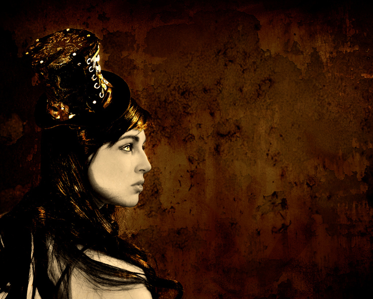
Today’s image has been sent to us by Keith. Thanks, Keith, for being patient over the last several weeks while I was, **cough cough**, absent from posting. Okay, lets get into it…

© Keith M's image critique

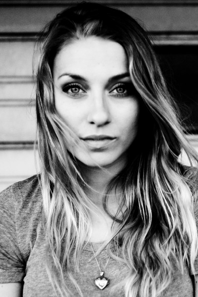
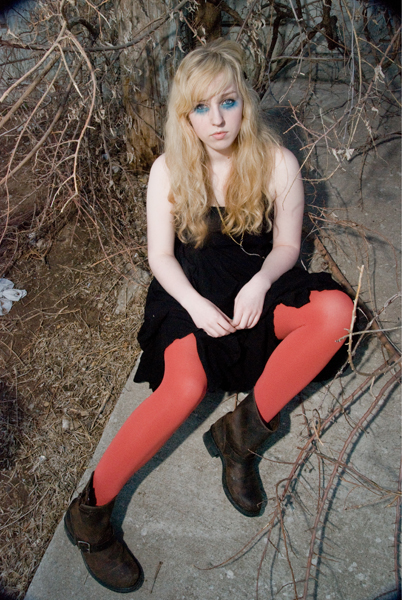
First off, lets talk about the composition. It’s a well done headshot. Following the “rule of thirds,” the subject’s eyes are positioned on the top third of the frame. I really like the movement of the subject’s hair – very natural. The background is pretty good. I might have moved the subject a little to the left, getting rid of the black void tot the right of her head. But its not too bad; a mere nit-pick really. The lighting is well handled, and exposure is spot on.

There are a couple of aspects of this image that I think are simply golden. You absolutely nailed the subject’s expression. I love the pleasant eyes, the slightly open mouth – the entire expression is great. The eyes are perfectly engaged with the camera. The eyes are the single most important part of any portrait, especially a headshot, and even more so when they are looking into the camera. And you nailed it! If the eyes aren’t engaged, then you’ve lost it. Think of it this way, lets say you had this exact image, only the eyes were at mid-blink. The shot would be ruined. As the old saying goes, “the eyes have it” (or something like that). The expression and the eyes are what make this such a strong image. Nicely done.

Now lets discuss how the image might improve. As photographers, we should continually be stretching ourselves, looking for ways to improve what we create. So what could you do next time to improve on this image? I’ve already mentioned my nit-pick about the background, so I won’t go over that again. But the most distracting part about this image to me, oddly enough, also has to do with the subject’s eyes/face. They simply aren’t sharp. Now, depending on what you were going for, its not necessarily “bad.” The face/eyes have that sort of old-time, high-ISO film look. Remember when you’d shoot ISO 1600 or 3200 film, and the detail simply wasn’t there? No? Well trust me. When you shoot 3200 speed film, it lacks detail, no matter how dead-on your focus was. If that’s the look you were going for then great. Great except for one problem. As you look down the frame, you’ll notice the subject’s hair, shirt, and necklace all have more detail than her eyes/face. So, if you’re going for that look, creating it in post-production, then don’t forget the rest of the image.

On the other hand, if you weren’t going for that old-time film look, then the face and eyes simply need to have more detail. Though the “old-time” film look is nice, I would like to have seen sharper details in the face. I’m not sure what caused it, but again, compared to the shirt/hair/necklace area, the face leaves something to be desired. Is it horrible? No, not at all. In fact, its somewhat acceptable in my opinion. But, since we’re committed to our craft, actively looking for things on which to improve, then this is one area of this image we can look at and learn from. Actively scrutinizing our work, helps us hone our skills.

Overall, Keith, I think this is a well done portrait. A few minor tweaks, and you’d have a shoe-in for your portfolio.

Now a reminder to all of us, myself included. Getting out from under the keyboard, picking up our cameras, getting out there and shooting, messing things up, and evaluating what we create is the single best thing we can do to improve. Remember, YOU are the single most important aspect of your craft. Not your gear. Not your subject. Not your settings. Not your location. Not even your skill level. Its YOU. So have some fun, get YOURSELF out there and make YOURSELF better.

As always, in an attempt to improve the photography community at large, please feel free to post a comment and offer some constructive criticism. We all see things differently, and I am by no means the final authority on anyone’s work. See something different? Post a comment. Disagree with me? Post a comment. We’re in this together. Lets help each other out.

Alright, enough is enough,

now, go out and shoot something!

May 25, 2010

Stacy F's Image Critique...

© Stacy Fields

Hello everyone. Here we go with this week’s image critique. This one comes to us again from Stacy F. She sends us a shot of a fire-breathing, stilt-walking, back-alley dwelling, guy. So lets get to it…

Fist off, this image is very striking, very interesting. Immediately, I was drawn into the image, to figure out what’s going on. Nothing like an abnormally tall man spewing fire from his mouth to peak one’s interest. Love it. One thing that will always raise impact level is to shoot subjects seldom seen. I can tell you, with absolute certainty, the number of times I’ve seen a photograph of a guy on stilts breathing fire – three (counting this one). If it were a shot of, say, a squirrel at the park, then it’d be much harder to hold my attention (I saw enough squirrel photos the first week of photog school alone to last me a lifetime). So just by having such an interesting subject you’ve started off with a huge plus. And then there’s the scene. The creepy, decaying, dead-end alleyway is a great place to place your subject. It really gives it that “I’m-lost-and-went-the-wrong-way-down-a-dead-end-alleyway-and-there’s-bars-on-the-windows-and-a-creepy-fire-breathing-carney-in-the-shadows” vibe. It really works with your subject.

The exposure of the image is very well done. You have handled your flash very well. Wait…What? Flash?? That’s right. It may not have as short of a flash duration as, say, an SB-900, but the fire is acting as a flash, illuminating the entire scene. And you’ve exposed for it quite well. You were even able to underexpose the sky by a couple of stops or so, keeping it a dark, rich blue, which is very suitable to the overall image. I also love how the fire creates so much contrast and deep shadows.

Lets talk composition. Here’s where the image could use a little work. The position of the scene is placed nicely within the frame. The angle of the walls framing the sky, the dark shadows to the left and bottom right. So kudos for the composition of the scene. The placement of your subject could use a little work though. As is, its not too bad. But I think if you were to have placed him further into the corner, turned him 180° (facing to the left) and had him blowing the fire towards the left (at the same upward angle), it would have been a stronger image. That would anchor him in the middle of all those great leading lines the building is creating. We could also see his face, which would add some interest as well. Whenever I'm on a shoot like this, I’ll shoot my subject from several different angles and positions, exploring as many options as possible. And maybe you did that. But for this image, a little moving of the image would make it a bit more powerful.

Overall, I really like this image. It has a lot of interesting components. And there’s really only minimal tweaks that I think would help it out. Nicely done Stacy. Keep up the great work!

Now, go out and shoot something!

May 11, 2010

Brad V's Image Critique...

© Bradly V.
This week’s image critique comes to us again from Brad V. The image is of a tree standing in a cut crop field, in black and white. So lets get to it…

First off, the image is composed pretty well. The tree, which is the subject of the image, is placed in the right third of the frame. As a general rule, it is much more pleasing to break the frame into thirds, and then place the subject of a photograph in on one of those planes. Sometimes, rules need to be broken, but for this shot, it was rightly followed. Had the tree been placed in the dead center of the frame, the overall image would loose much of its interest.

One that would have helped the composition would be to use the leading lines of the crop rows. Notice how the lines created by the crops in the lower left of the frame lead your eye into the image. Now, picture the base of the tree at the pinnacle of those lines. The viewer’s eye would be lead right up into the subject of the photo. But, wait, you can’t transplant a grown tree, so how would you make this happen? Well, assuming that all the crops in this field were planted in rows, you could have walked further to the right until the tree was in line. It may mean your subject would have to be in the left of the frame, but it would allow you to further draw the eye to your subject. The way it is now, these lines compete with the tree, the subject of the image. Its not necessarily bad, but could be that much better using the crop rows.

I really like the heavy use of grain in the image. It adds a good amount of texture to the image, giving it more depth. It has an “old-school-photo-shot-50-years-ago” feel, which adds to the “fine art”-ness of the image.

I like the choice to use Black & White. However, it seems to be more Dark Grey & Light Grey, instead of black and white. In other words: Its Flat. It simply needs more “pop”. You can adjust the levels from this:
Before

To this:
After

Notice that I just pulled in the sliders from the left (shadows) and right (highlights), and moved the middle slider (contrast) to the right. The made the image pop off the screen (I didn’t post the adjusted version because I didn’t obtain permission from Brad to publicly “hack” his image). Whenever creating B/W images, they really need to have areas of deep black and bright whites. This way the images have more impact, more “umph” to the viewer. Black and white images need to smack viewers in the face. And this image falls just a little short of that.

The biggest problem this image has is the white halo-ing around all the tiny branches of the main tree (which is near impossible to see here on the blog). I'm not sure what happened here, but its just too distracting. It looks as though you needed to darken the sky, using the magic wand tool in photoshop to select it, then darkened the selected area. The problem though, is this always leaves an edge around whatever is selected. This can be “fixed”, but it would take an insane amount of time to go around every little twig, darkening the halo. This could have been captured in camera using a Circular Polarizer (or, since shooting B/W, maybe an 80A filter). A Circular Polarizer polarizes stray light in the sky, darkening the blue, and giving more contrast to the clouds. And it does nothing to the colors of a scene. But, it is dark, which forces a slower shutter speed by a couple of stops, maybe causing the need for a tripod, so be aware of that.

Overall, this image is pretty good. But it needs a little work to get it to the next level; the level that really “wows” people. Thanks for sharing your image with us Brad! I hope I’ve given you some things to help you along. You’ve been doing some great work, and you seem to be improving, so keep it up!!

Now, go out and shoot something!

May 4, 2010

My Image Critique...

© Todd Walker

Hey everyone. I've got a bit of a curve ball to throw at you. This week, instead of me critiquing one of your images, I would like your thoughts on one of mine. So those of you who read the blog, especially those of you who've had images critiqued on here, I'd really like to get your input. So, for the image above, give me your critique in the comments below. I can't wait to hear what you have to say!

Also, I'll have my regular post on thursday, but I will be posting some of my work from the previous month on Friday. It's time again for First Friday Photos!! so be on the lookout for that!

Now, go out and shoot something!! (right after critiquing my image) =)

April 27, 2010

Stacy F's Image Critique

© Stacy Fields

Happy Tuesday everyone. . . Lets get to this week's critique.

This one comes again from Stacy. The image is of a girl in a hat. This one is very heavy on the graphic side, as a apposed to a straight photograph. I must say, I love this image. Very well executed.

First off, the lighting is handled very well. The high level of contrast between the face and hair is very suitable for this type of image. The deep shadows keeps a level of "darkness" to the image that perfect for the image. As always, the lighting is what makes this image what it is. Use broad lighting and low contrast, and the image looses its impact. The expression on the subject works well. And the hat. . . the hat is a great detail, adding so much interest to the subject. Adding the hat to the subject took the interest level up several notches. Without it, the image would still be great, but with it, its on a whole other level. So bravo on the decision to use the hat.

As you all know, I love compositions heavily weighted to one side. So its no surprise that I really like the composition here. The dead space to the right of the subject adds so much interest to the overall image. Shoot it as a tight, portrait (vertical) composition, and it looses a lot of its impact. So shooting it as a landscape (horizontal) composition was a good decision (in my opinion anyway).

A few more things I like about the image: first) the textured background. Its only adds to the interest of the image. Nothing like a gritty, decaying wall to add interest to any image. B) the coloring of the image. The overall "rusty" look is awesome. And 3) whatever you did to the eyes. . . love it! It may be hard to see on the blog, but the sharp, golden eye "pops" really well out of the rusty surroundings.

Now, on to some things to consider that could make the image stronger. The first thing I think would help would be to add a hard accent, or edge light to the back side of the subject. Not to illuminate the entire left side, I like the deep shadows. But just a little rim light on the back edge of the subject would help separate her from the background. Also, the light on the front of the hat, on the laces is a bit too bright. This is the brightest area in the image, thus pulling the eye to that spot. Now, if you intended to focus on the hat, then I'd leave it alone. However, if you intend ed for the girls to be the true subject of the image, then her face, particularly her eye, should be the focus. So, if you couldn't (or overlooked) modifying the amount of light hitting the laces, then you should burn them down in post production. Darkening that area would allow the eye to be the brightest area, and thus drawing the eye more naturally to that spot.

Overall, this image is stellar, a very striking image. Keep it up Stacy, you're on your way to becoming a huge part of the photographic community! Thanks for sharing your work with us. I look forward to following your work.

As always, anyone reading this is welcome to chime in on Stacy's image. So what's your opinion? What'd I miss? Feel free to offer your opinion in the comments! Also, if you have any images you'd like for me to give my opinion on, you can e-mail them to me at toddwalkerphotography@gmail.com. I only use them on the blog, for the critiques, and for the purpose of helping the photographic community improve. I also do not use last names, or link any image to your website. This is so your clients won't come across my critique through google, who sees all and knows all. The last thing I want is for you to loose potential clients because they saw a critique of your work, even though you are using the input to improve your craft. So, I am vague as to who send in the images.

Now, go out and shoot something!

April 20, 2010

Nikki C's Image Critique

© Nicole Castic

Hello everyone. Welcome to the new blog schedule. In case you missed it, business has been picking up, which means my time has become more scarce. So, in an attempt to keep my life balanced, I'll only be posting twice a week until further notice. Tuesdays will be critiques, and Thursdays will be technique and your questions answered. So keep sending in your images and questions, I'll still be offering my two cents. I'll also continue to post my work the first Friday of every month.

This past Sunday, I was glad to finally get out and shoot FOR FUN! Its funny how so many of us begin in photography for the pure enjoyment of it. But then we begin to make a living at it. And before we know it, though its still a lot of fun, we find ourselves shooting for everyone else but ourselves. I'm finding I have to fight for the opportunity to just go out and shoot for the fun of it. Sunday, there were six of us, plus my wife and daughter, who met downtown just for the fun of it. And, despite being very late (my daughter is 21 months old), and only shooting for an hour or so, it was great fun. Afterwards most of us even went out to eat (thank you Beki for diner!). I'm looking forward to doing this more and more. It helps my creativity to shoot for no one but myself. I'll be sure to let you know when our next GOYA shoot is, and hopefully more of you can join us. =)

Now, on to this week's image critique. This shot is sent in to us again from Nikki C. The shot is of a dude with some spiffy sunglasses on.

Overall, I think this image is pretty well executed. Most of the images I've been getting for the critiques have been very good, its been difficult to find much to improve on. And such is the case with this one. Being an editorial portrait photographer myself, I love the composition of this shot - subject heavy to the left, lots of dead space to the right, perfect for type. Of course, this is my style, and not everyone is gonna give the composition the same love I do. And that's okay. If we all saw everything the same way, and created everything exactly the same, photography would be a terrible thing. Ugh, the thought of that is almost to horrible to bear. . . anyway, back to the critique. . .

I also really like the stoic expression of the subject. It goes well with the shades. The reflection in the glasses is also nice; it adds to the interest of the image. I find myself trying to figure out what's going on in the reflection - where is he, what's he looking at, etc.

Lets discuss a few things that could make the image a bit stronger. I love the pure white background. But, judging by the dude's hair, the background was dropped out in post. This, of course is fine, it makes a great image, but the edge around the subject needs to be a bit cleaner. Its very difficult to see on the web, but his left jaw line, and all along his hair is a bit jagged. So watch out for that.

Another thing that could be tweaked is the contrast. The subject is a little flat. The skin tone and shirt are a little too grey. As is, its not bad. But boosting the contrast will give it just enough "pop" to take it to the next level.

Overall this shot is well done. A couple of tweaks and it'd be that much better. Nice job Nikki! Keep up the good work!

Anyone have anything else to add? Feel free to post a comment below. Also, let me take another opportunity to say to anyone out there, you are welcome to send in your images for critique at toddwalkerphotography@gmail.com . Also e-mail me any photography related questions and I'll do my best to answer anything I can. I'm not the end-all authority on photography, but together we all can help each other improve our craft.

Tune in Thursday for the next post. Until then...

Go out and shoot something!

April 12, 2010

Garrett D's Image Critique...

© Garrett DeRossett
Happy Monday everyone. For those of you who have been following the blog, you undoubtedly noticed I skipped Friday's post. I had an incredibly busy week/weekend, and simply didn't have the time to get onto my computer. Sorry about not posting it, but it was great to be busy =).

This week's image up for critique comes to us from my buddy Garret D. from Springfield, Mo. He's fairly new to photography, but has developed quite an eye. The image he sent is one from his very first senior photo session, shot just a few weeks ago. And if I remember correctly, he shot it on film - actual, 35mm negative print film. Garret shoots a great deal of his work on film, because it fits his style. Good for you Garrett. Way to stick to your guns. So lets get to it...

Overall, especially for a first senior session, the image is pretty well executed. We all know, posing/directing our subjects is difficult. And multiply that ten times over when it's a person we don't know. I still struggle with engaging, directing, and posing my subjects. I am much better than when I began, but I still have a long way to go in my "directing" skills. Natural people skills are a plus, but directing a subject on a shot demands something more. If we are going to be photographing people, then we must be committed to developing our directing skills. And this comes largely from experience. In this image, the subject's expression is very good. He looks relaxed, and is engaging the viewer. Best of all, it looks like something is going on in his mind. With this sort of expression, it wouldn't be much of a stretch to get a blank, unengaged look. So nice job on that.

Aside from some problems with the composition, which I'll touch on in a moment, I like the use of leading lines. The bottom of the fence on the left, and the bottom of the wall on the right lead the eye right into the subject. This, too, was well done.

Lets look at a few things that could improve the image. The first thing I'd like to mention is the subject's pose. Generally, it makes for a more pleasing pose to angle the shoulders one way or the other. This would create an angle to the subject's shoulders, and project a more interesting pose. Also, whenever the shoulders are squared to the camera it widens the subject, which isn't so bad for males, but not usually appreciated by the ladies (for the most part, the squared shouldered pose here isn't bad. It works pretty good. BUT, it may be a bit stronger to angle 'em. I mention this mostly for the sake of discussion).

The next thing I'd like to point out is the composition. Notice how the subject's head is smack in the middle of the frame. It would be a stronger image if you were to drop the camera so his head is in the upper third of the frame. THEN, turn the camera to the right, so the subject is in the left third of the frame. You would still have the leading lines of the wall, which would still lead the eye to the subject. Also, by turning the camera to the right, you would nearly eliminate the blown-out highlight area on the left side of the frame. This bright area is somewhat distracting, drawing the eye away from the subject. Shooting in the open shade of an alleyway is a great place for a shoot (I shot several frames this way in downtown Tulsa just yesterday). But you have to be careful of the contrast between the shade and direct sunlight. If both areas are in the frame, exposing for the shade will likely blowout the area in the sun. Adversely, if you expose for the sunlit area, your subject will probably be too dark. It makes life much easier if you avoid this mix of lights in your frame, if you can help it.

But lets say, you shot it this way, and this is the image you have to work with (I end up in this scenario more times than I'd like to admit). What can we do? One thing we can do, without going into a ton of fancy-pants photoshopping is to crop down some. With this image, we can still achieve the above results simply by cropping the image. Here's what I'm talking about:

© Garrett DeRossett

Notice how the subject is to the left of the image, and his head is now towards the top of the frame. Also, the bright area has been greatly reduced, much less distracting (Thanks Garrett, for letting me hack your photo). =)

One last thing to watch out for is things in the background behind your subject. Notice how the doorway to the right of the subject's head comes very close to intersecting the head. Its great that it doesn't, but would be that much better if there were more separation between the two.

Overall, Garrett, its a great first senior photo! And, having seen many of the others from the shoot, you did an outstanding job! Thank you for letting us see and discuss your work. We look forward to seeing more of your stuff as you continue to pursue your photography. Keep it up!

Now, go out and shoot something!

April 5, 2010

Beki T's Image Critique

© Beki Tillotson

Good morning everyone. I trust you all had a good Resurrection day yesterday. We had a wonderful weekend with Jenny’s family in northern Missouri, filled with good food, lots of chocolate, and dozens of hidden eggs.

Now its Monday, and everybody’s back to the grind. So lets get to it… This week’s image up for critique comes from my good friend, Ms. Black & White herself, Beki T. You can check out her work HERE; and her super informative blog HERE. If you’re a photographer at any level, I’d highly recommend looking into her blog!

The image she sent in is a BW detail shot of a hand against an obscure and out-of-focus background. Being an abstract detail type of shot, this kind of image is very subjective. The image is subjective to the interpretation of the viewer. And regardless of what I, or anyone else says, the viewer either likes the image or they don’t. It’s that simple.

I like the feel of the image. There’s a story behind this image – a story I, the viewer, am free to narrate. It makes me think to myself “what’s this person doing? Is she going somewhere? Or is she looking at something she’s already done?” The darkness of the overall image makes me lean towards the later, thinking the subject has just done something dark and sinister. But hey, that’s me. That’s my subjectivity. Overall, the image is intriguing, interesting. It makes me stop and think, and wonder what’s going on. What do you think is going on?

Lets take a look at the technical aspect f the image. I like the shallow depth of field. Isolating the subject from the background is a major key to making this shot work. It looks like a very busy background, which would distract from the subject. By being out of focus, our eye is lead straight to the hand. And, while we’re on it, for all the gear-geeks out there, the Bokeh is quite nice =).

I’m not sure what the colors were like, but the use of black and white works well. It helps serve my dark narrative for the shot. As does the high level of contrast. The contrast brings out the gritty dirt on the palm. Which again adds to my case for the dark scenario.

I also like the composition, lots of dead space on the left. Of course, I shoot in an editorial style, so go figure. Concerning the composition, I like how there’s near black on the left, graduating to lighter as we look right, then back to a darker grey tone on the subject’s shirt. This creates a stark contrast between the BG and the subjects hand, and keeps our eye right there.

The only thing I can nit-pick about this image is its exposure. Again, I stress “nit-pick.” Now, if the aim of this image was in fact a darker scenario, then it was nailed. However, if the intention was a more pleasant scene, then it needs to be brighter. And, the dirt on the hand needs smoothed out or removed. But again, this all depends on the intent of the final result.

So that’s it. That’s my two cents for this week. And, as usual, everyone reading this is welcome to offer their comments on this shot. Its an open forum. So feel free to make a comment, suggestion, or ask a question. As iron sharpens iron, together we sharpen one another’s skills in our craft.

Lastly, for those of you in the TULSA area, be on the lookout for an upcoming announcement. There might just be a hip new photoggin’ club starting soon. =).

Now, go out and shoot something!

March 29, 2010

Stacy F's Image Critique

© Stacy Fields

First off, let me start by saying I need more images to critique, and questions to answer. I have a few more in each category, but I’ll be needing more soon. So, if you’re out there reading this, and need/would like to have one or more images critiqued, you can e-mail them to me (high resolution please, I’ll format them for the web) at toddwalkerphotography@gmail.com. I know many of you following this blog have questions. If you’ve noticed, I haven’t been putting names to the questions, so you don’t have to feel stupid, like you’re the only one out there who doesn’t know – even though you aren’t. So e-mail your questions, no matter how “dumb” or insignificant they may be. Okay? Okay. Now on to the image critique.

This week’s image comes to us again from Stacy. Its her second to be put up for discussion. The image is a detail shot of a flower with water drops on the petals. Now I’ll be the first to tell you that I’m not a macro/flower/pretty-shapes-made-with-water-drops expert. I'm a portrait photographer. However, I do have an eye for beauty and I know what I like. And I like this shot, and have a few things to say. BUT, on any shot like this, I’ll always defer to you nature photographers out there. If that’s you, please post your thoughts in the comments section below.

First thing I like is the tight composition. This helps to accentuate the drops of water all over the frame. Its busy, but in a good way. It has good contrast which make it a striking image. There’s good specular highlights on the water drops; good texture to the petals; and the black background was a good choice. Though, I’d be interested to see this same shot on a white bg. Scratch that, I just swapped the bg in PS and it’s not nearly as nice white as it is black. So nice choice. Overall a very nicely done image.

Here’s a couple of things I’d like to point out. Not necessarily negatives, but some things to help us think a bit. This type of subject is suitable for selective focusing. Though I think the deep depth of focus works well, you could also use a very shallow depth of focus and highlight say, one petal, or one row or droplets. You can do this of course by opening up your aperture to say f/3.5 or f/2.8 or larger.

Another thing that you could do is limit the amount of water droplets. If you had say even only one large drop, it would draw the eye to one focal point. This would create a completely different image, the drop itself would become the main subject, and the flower merely environmental.

Again, these are merely pointed out for thinking and discussion. The image as is, is great. Keep up the good work Stacy!

Now, go out and shoot something!

March 22, 2010

April C's Image Critique (#2)


Friday, Jenny and I went out to eat, then hit the IMAX to watch Alice in Wonderland in 3D. It was brilliant. The day was beautifully sunny, reaching a delightful 70 degrees. But then it was over and Saturday came. We woke up to 8 inches of snow, and hit a frosty high of 32 degrees. How’s that for the first day of Spring? Gotta’ love Oklahoma weather. But I digress…

This week we have another image from April C. She’s the first to have a second image critiqued. I’m honored that several of you have sent in multiple images for me to scrutinize. From all the feedback, its been a worthy and beneficial exercise. So as long as you keep sending in the images, I’ll keep giving them my two cents.

April’s image this week is of a girl dancing, captured on a pure white background. I’d like to start with covering what’s great about the image. First of all, I love the posing of the subject. There’s a ton of movement, showing a good amount of motion. This is perfect for a dancer. I really like the movement of the hair. Its crazy, all over the place, but you can still see much of the subject’s face. I also really like the posing of the subject’s body. Every joint is bent, which adds so much interest to the subject. Overall, the posing is excellent.

Another thing I like is the composition. I am a huge fan of dead space. Maybe its because I tend to have an editorial style to my own work. At any rate, it’s a great use of the extra dead space to the right of the subject. Its perfect for any use – it’d look great framed on the wall; and it’d be great for a magazine spread. It’s very multi-usable (is that a word?).

Now, on to the negative. First of all, the white background isn’t actually pure white. I'm sure its hard to see here on the blog, but there are areas that have a light grey hue. There’s a grey outline around the subject, and a grey line running across the top of the image. This is an easy fix in photoshop. All we have to do is use the dodge tool and clean it up a bit. If you’ve been following the blog for a while, you know how much I preach capturing the image IN CAMERA and not relying on photoshop to fix things. Well, this is one area I think photoshop is essential in creating the image. If you’ve ever shot a white seamless background, you know how hard it is to get it pure white. The lighting has to be perfect. You have to light your subject separately from your background. Then you have to light the background around 1.5 stops brighter than the subject exposure. And it has to be lit very evenly. This is usually done with at least three lights. To get everything perfect is very, very difficult. And even when you think everything is perfect, you open up the image in post only to find the BG is a tad grey. In this type of shooting, its almost a given you’ll be cleaning this stuff up in post. And it’ll take all of 30 seconds to do. So this is one of the few times you’ll here me say “this is an easy fix in photoshop.”

The only other thing that I find problematic is the light spilling over the subjects right leg. It looks as though a BG light is spilling back into the camera, just enough to wipe out the contrast on that leg. This is something that could have been fixed on set with better placement of a flag to block the light spill. But say you didn’t notice it while shooting (slow down), this too can be fixed in photoshop. Just burn it in a little and you’ll have your contrast back. But this just adds time at the computer fixing stuff, instead of using that time for creativity.

Overall though, you’ve captured a great image April! Thanks for sending it in. If anyone has anything to add, leave a comment.

Now, go out and shoot something!

March 15, 2010

Brad V's Image Critique


Good morning everyone. Time for another image critique. This week’s image comes to us from Brad V. Brad came across the blog while reading the discussion board on Jasmine Star’s facebook page. That’s one of the many places I stay plugged into in the greater photography community, giving back as much as I can. Brad told me he’s new to photography, and would appreciate any advice I (we) could give.

First off, I’d like to reiterate that I do not take these critiques lightly. I offer them for one purpose: to help others improve. I never mean to offend, but neither will I sugar-coat my thoughts. So, with that said, lets get to it.

The image is a sort of a fashion shot of a woman in an alley. Overall, I think the image is pretty well done. It looks to be shot in available daylight, exposed well. Whenever we use available daylight, shooting in the open shade works well for portraiture. If we shoot in direct sunlight, the highlights can be too harsh and the shadows too dark. The open shade gives us that nice diffused light, resulting in a nice buttery skin tone. It was a great choice for this shot.

Next lets look at the composition. Overall the crouching position of the subject works well. If the image is intended as a portrait, one thing that would make it stronger would be to have the subject’s eyes looking at the camera. In portraiture, eyes are a person’s most important feature. They are the window to the soul. With the eyes looking to the camera, it would solidify a deeper connection with the viewer. It would draw the viewer into the image, and more than that, into the subject herself. The pose is pleasing, but eye contact would give greater impact to the image. On the other hand, if the aim is to showcase the outfit, a fashion shot, the eyes are much less important. In fact, by having the eyes looking away from the camera, the viewer is inclined to stay focused on the clothing, which is what you want in a fashion shot. The subject’s expression is fine overall, but depending on whether it’s a portrait or fashion, the eyes could be recomposed.

One thing that bugs me, just a little, is the subject’s left hand. This is a nit-picky thing to mention. But it seems a bit awkward. Perhaps moving the hand up to the waist, rotating the wrist so the thumb points towards her back, would look more natural. But again, this is a nit-pick. I only mention it to keep us continually thinking.

The next thing concerning the composition I’d like to discuss is the background. I like the alleyway. It’s a nice contrast to the beauty of the subject. But the placement of the subject needs to be adjusted. I’m can’t help but notice the dark line running through the subjects head. There’s a nice, dark blue building that abruptly stops and turns to bright white right behind the subject’s head. One thing we could do is move the camera around to the right, filling up the entire background with the dark blue building. This would give a consistent color behind the subject, which would be less distracting. Now, of course I have no idea what is to the left, if it would even be possible to do this. But assuming the blue building continues, this would be a much more pleasing background.

Lets say, however, something prohibited us from moving the camera, and this angle is all we have to work with. Another thing we could do is center our subject’s head between the blue building and the telephone pole. This would better frame our subject’s head. If there isn’t enough room, and I cringe as I type this, we may have to do a minor bit of photoshop to remove the pole. I cringe because we must strive to capture the perfect image in the camera. We should NEVER rely on photoshop to fix sloppy photography. Slow down, think it through, take the shot. More times than not, we are able to fix any problems we have, before we shoot it. If we commit to being disciplined in this manner, we are then able to use photoshop for creativity, not for fixing poor photography. (okay, stepping down from the soap box now…) If, as a last resort, we have to remove the telephone pole in post production, at least there wouldn’t be anything intersecting her head – always a plus =).

All in all Brad, you’ve succeeded in creating a nice image. If you are new to the craft, you have a good eye on which to build. Keep up the great work and check in from time to time to let us know how things are going!

Now, go out and shoot something!

March 8, 2010

Nikki C's Image Critique

© Nicole Castic

First off, I want to say thank you for all the heartfelt well-wishes for my family concerning the death of my Uncle. It has been a very rough week. But, sad as we are, we are doing well.

Secondly, I missed my “First Friday Photos” last week because of everything going on. I’ll be posting them this coming Friday instead.

Now, on to this week’s image critique. The image comes to us from Nikki C. She’s submitted a picture of a baby wearing a Santa hat and a reindeer necktie. So lets get into it…

Lets first look at the lighting. The lighting is okay. Its well executed, but nothing to tell your friends about. It looks to be around a 1:3 ratio, suitable for this type of image – very safe. I do have a bit of the issue with the vignette though. Now, I am a huge fan of vignettes, using them on a majority of my images. But it has to be done well to work. A vignette is supposed to focus the eye towards the center of the image. But when it begins to overlap the subject, it simply doesn’t look right. The problem I have here is it bleeds too much into the subject. Notice the white ball of the hat and the baby’s foremost foot. They’re grey, looking unlit. And that bugs me. The band on the hat is nice and white, but the ball is muddy grey. Same thing about the skin. Most of it looks good, but that one foot looks like it has circulation problems (and if that’s the case, um… yeah, sorry ‘bout that). This image simply doesn’t need the vignette.

Next lets look at the green/red background. I get it. It’s a Christmas thing. But, ugh, really? To me this is in the same boat as selective coloring. The only time we should see this kind of stuff is many years in the future, when we open a time capsule from the 1990’s. Just sayin’. The thing is, good lighting on a cute kid is enough. We don’t need the nifty green and red to make it more than it is. He’s already wearing a cute Santa hat and reindeer necktie. What more do we need to say “this is my Christmas portrait?” Leave off the vignette, use a pure white background, and it would be a much stronger image.

The last thing I’d like to discuss is the baby’s pose/expression. Photographing babies and young children can be a very difficult. I’ve spent nearly 20 months shooting literally thousands upon thousands of images, trying to become better at photographing children - not coincidentally my daughter is almost 20 months old =). Capturing that perfect expression is hard to do. So anytime we get a good expression its a victory. In this image, the baby’s upright and alert, and the expression is pleasant. It may not be the perfect expression, but it’s a victory nonetheless.

The last thing I want to mention about this image is, well, I’ve seen it before. If you were going for cookie-cutter lower-end portraiture, then this image nails it. But if you want to truly excel at children portraiture, you need to figure out how to get to the next level. Why has Anne Gedes been able to build a multi-million dollar business? Simple - what she creates is not run of the mill baby pictures. She broke the mold, pushed the envelope, (insert cliché here). Nothing she creates is cookie cutter. I enjoy her work because its different, intriguing, enjoyable. Should we aspire to photograph babies like her? Not at all. Quite the contrary. If you are into photographing children, do so in your own unique way. But you must push past mediocre. Force yourself to become better. Strive to try new things. Break away from the status quo. Do something different. That’s what Anne Gedes did at some point. She decided to try something new, and now she’s selling books of her work with Celen Dion Cds inside. How could that not be a money maker?

Well, there you go. Yet another pair of my pennies. Thank you Nikki for sharing your work with us! Anyone else have anything constructive to say? Post a Comment below.

Now, go out and shoot something!

February 28, 2010

Stephen S's Image Critique

© Stephen Smith

This week’s image up for discussion comes from Stephen S. (known as “Sleven,” back in photogin’ school). His image is of a guy smoking a cigarette, the smoke of which creates a skull and crossbones.

My first reaction was, “wow, that’s a great image.” The image does exactly what its supposed to do: invoke a reaction. Its sharp, well lit, and well composed. The editorial style properly uses dead space which is suitable for text. The deep lighting ratio allows our eye to naturally lead away from the guy to the smoke, which is the real subject of the image. And speaking of the smoke, overall, its simply sick - such a good graphic! A ton of PS work I’m sure, but it was worth it. It paid off.

There are a couple of areas I see that could be improved. These are highly trivial at best. The first thing is the skull formed in the smoke. Let me preface this by saying this is nit-picky, and 99.99% of people would never see it. In fact, people reading this post won’t be able to see it because the image is so small. But when I zoom in to the skull, the edges in the eyes, nose and mouth, are a little too choppy, a little too ridged. The rest of the skull is so well done. The smoke looks very natural and wispy. But these areas look like they’ve been erased with the eraser tool in PS. Nit-picky for sure, but these edges aren’t consistent with the rest of the skull. Looking at the top of the skull and most of the crossbones, the edges look awesome. They look like wispy smoke, but are still well defined. Maybe instead of erasing the edges in question, you could replicate the areas that are so well done. Or, instead of erasing, maybe you could apply some heavy burning (no pun intended). This might give you the same effect, but without the abrupt deletion of the smoke. But again, this is highly trivial. Just an exercise in trying to improve, even when there is little room for improvement.

The second thing I think would help the image just a tad, would be to add a hair light. It kinda bugs me that the dude’s head disappears into oblivion. I think it would help visually replicate the skull and crossbones. Doing so would better tie the guy’s head and the skull together - showing what’s gonna’ happen to him if he keeps smoking.

Those are two very small things that could be improved upon. As is, the image is quite good. Nicely done Sleven! Thanks for sending it in! Keep doing what you’re doing. On second thought, don’t keep doing what you’re doing – strive to get even better!!

Anyone have anything else to say about Stephen’s photo? Feel free to post a comment and chime in! But, as always, be respectful of your fellow photog. Any ignorant or unhelpful comments will be removed and your hard drive will crash. Okay, maybe not, but it made you think didn’t it? =)

To everyone else out there reading this:: If you are interested in having your image(s) critiqued, you can email them to toddwalkerphotography@gmail.com. Large files please, I'll resize them myself (and I promise not to use them for anything other than the one blog post). Put “Critique” in the subject line. I take these very seriously, and vow to give you an honest, worthwhile assessment of your images. My goal is to improve our craft as a whole. I’d love to see your stuff, and try my best to help you improve.

Now, go out and shoot something!

February 22, 2010

Stacy F.'s Image Critique

© Stacy Fields

Today’s image up for discussion comes to us from Stacy F. The photo above was shot for an advertising assignment she recently had in school. She said she had gotten some negative feedback about the lighting, sharpness, etc., but nothing that helped her pin down what this image might be lacking. So she’s asking for help.

First off, lets talk about commercial photography. It’s a beast. I’ve known photographers to take several days, tens of thousands of dollars, and multi-person crews just to get one product shot. Commercial photography is not for the faint of heart. Advertising is big business and big bucks. And if a company s going to shell out the money for an image, they require perfection. So, anytime we take on a commercial advertising job, we have to be thinking perfection, lofty a goal as that may seem. I tip my hat to commercial photographers. They do some amazing stuff.

So, lets first take a look at Stacy’s composition. Most of the time you will need to include space in your image for type. The overall composition is pretty well done, and you’ve done a fair job of leaving enough room on the left side and at top for some wording. The position of the poured water is a little off. something about it draws my eye away from the product (which is the opposite of what you want). Of course there are a million and one ways to set this shot up, but perhaps you could have the water come down right smack in the middle of the frame, with the product arranged tightly on both sides. Leave a little dead space on both sides for copy. Then everything would be right there, centered, in your face. You might also either move the “horizon” line wither down (eliminating un-needed extra stuff at the bottom), or up (eliminating the un-needed void at the top). Eliminating the void at top would put more focus on the effect the water has in the foreground, which would be good, since it would allude to the essence of the product (not to mention the point of your assignment).

As far as the lighting goes… its pretty good overall. The reason I think you may have gotten some negative feedback is the image lacks a bit of punch. The background is nice , even, and pure white. The product is pretty well lit, but could use a bit more light. It seems a bit on the muddy (dark) side. Not terribly dark, but enough to notice. And the foreground is too under-lit. You have a decent amount of texture and contrast on the water between the bottles to the right. But the water in the middle and to the left really needs to have the same amount of “pop” as that on the right side. And the way we show texture (even the texture of water), is by cross (or side) lighting. The reason the water on the right pops so well is the light from your BG is giving it the proper amount of cross lighting. In the middle, the BG is being blocked by the product and you loose the cross lighting. Same goes for the left side, it lack pop. I’m not sure your lighting setup here, but if you would have had a large light source to the front and camera right of the product. This may have added jut enough pop to the product, and given a good amount of cross light to the water. If not enough cross light, you could then add a another light with a snoot aimed directly across the water. This is definitely a trial and error type of shot. It would likely take several tries to get everything just right.

As for the sharpness, overall it seems okay. But remember, we’re aiming for perfection here. And your sharpness isn’t perfect. It could be that the water caused the bottles to shift a bit during exposure. Maybe a little more sharpening in post production is all you’d need. But at any rate, you need tack sharp detail top-to-bottom, left-to-right. The pouring water is also fuzzy, obviously because its moving. But I’m surprised you weren’t able to freeze it better. I think that is what causes the viewer to emphasize the softness of the image. The water is fuzzy, and then I look at the product, and notice their not spot on either. Maybe if you’d been able to truly freeze the water’s movement, the rest wouldn’t be as apparent. And, if you were to freeze the water’s movement, if the bottles moved due to the water, they would have been truly frozen as well. I’d be interested to know exactly how you set this shot up. I’m wondering if you used flash, if you also had bright ambient lights on in the room. Then, even though the flash froze the action, a slow shutter may have caught enough ambient light to blur the water and a moving bottle or two. I just don’t know…

Overall though, I think this shot is pretty well done. I think to make it really excel, you only need to tidy up a few things. You’ve heard me say it before, and you’ll hear me say it from here on out. Slow down, think it through, set it up, take the shot. Most of the time, the difference between a great shot and a pretty good shot is simply slowing down and thinking about it more. I beat this drum so much because I need to make it my habit as well.

Thanks Stacy for sharing your shot with us. Keep up the good work!

Now, go out and shoot something!

February 15, 2010

April C's Image Critique

© April Chompunuchtanin

Today’s image up for discussion comes to us from April C. The image above is of a bald guy with a guitar. But its not just any old photo of a bald guy with a guitar. It’s a very well done, editorial style portrait. It has several things going for it, that make it work.

First thing that makes this such a great image is the lighting. The lighting is very fitting for the subject. The lighting is dramatic, with deep shadows, which cut out the entire image. The lighting is also very well controlled. Notice how she concentrated the light on the subject’s face and guitar. From there, the light fades outward. Our eyes naturally go to the brightest area of a photograph. By properly controlling the light, it keeps your eye right where it should be, on the subject.

This image also has a very strong composition. April has done a wonderful job of using dead space, on the right side of the frame. This dark area, along with the guitar strings direct the eye strait to the subject. There are a lot of photogs out there that say its wrong to use dead space. This is only true if you’re going for a very classical portrait, and submitting it for a PPA contest. But this image is anything but classical portraiture. But that’s what makes it so interesting. Its not normal. It has broken the rules. Its outside the box. Its. . . good.

If I were to nit-pick and find something to improve on this image, it would be to add a catch light in the subject’s eye. Now, I realize there is a lot of effort in controlling the light in this shot. It looks like there is only one light being used. It also looks like the light is either shot through a snoot, or a grid spot. And, to use this one light source and get a catch light may completely screw up the lighting of the entire image. So, if you can’t move your light around for this image, you may have to add a second light. This doesn’t need to be much, a small flash at 1/64th power, with a very tight snoot aimed directly at that eye. Some care taken not to catch a reflection in the glasses and you’d have it. Again, this is a very miniscule, nit-picky thing to bring up. It really doesn’t need the catch light, but hey, I had to find something to push the envelope.

As always, this image is now up for comments form anyone who cares to add their opinion, for the betterment of the industry. So, what’d I miss?

Thanks April for subjecting your image to my textual lashings!! You’ve got some great stuff out there, and I’ glad you do what you do! Keep up the good work!

Now, go out and shoot something!

February 8, 2010

Jasmine K's Image Critique

©Jasmine Karlabach

Okay first things first. I have been calling these things “critiques.” And I will definitely give my two cents worth. But I’d really like for what I say to be the beginning of a discussion. I would like you (even you non-photogs out there reading this blog) to chime offer up advice in the comments section below. This is another way for you to get involved in the greater photography community. I am one guy with one point of view. But that’s all I have to offer. One perspective on any given image. And as we all know, art is subjective. So, for the sake of the industry, to help each other become better, please consider offering your perspective too.

Secondly, until I am able to record these critiques as a nifty little screen-grab video where you hear my stunningly handsome voice, and see my ever so smooth mouse movements, you’ll have suffer through reading them. Think of it as vintage internetting. You know, the days of dial-up.

Lastly, what I have to say in these critiques are in no way intended to offend the photographer. I do not take these critiques lightly. And I will never make fun of or belittle another photographer who is seeking to improve. I ask anyone offering further comments to do the same. My aim is to help you see the areas that need improving. My hope is that you, and everyone reading this, can use what I and others have to say, to become better. I appreciate all the images that have been sent in. Some are awesome and I’ll have a hard time finding flaws. Others have been sent in with obvious problems, and intended to be used for the benefit of the community. And some were given, honestly asking for help.

Now, on to photo critique numero uno. . .

First image up to bat comes to us from Jasmine. The image, seen above, is of a girl with blue makeup in the woods. The exposure is accurate and the image is sharp. The composition though, needs a little help. The girl seems to be sliding down an oddly placed slab of concrete. (Is she on an overgrown sidewalk?) If you notice her feet, they look like they’re keeping her from sliding. I’m sure its not that steep of an incline, but due to the high camera angle it makes me feel uneasy, like she’s about to slide out of the picture. Maybe moving the camera down a bit would alleviate this uneasiness.

The model’s pose isn’t all that bad, but not that great either. It has that fashion/editorial feel, but she seems a little lifeless, a little stoic. Maybe this is what you were going for, but look at the eyes. The eyes are the most telling thing in any portrait. You may have been going for that “I’m an emo girl and don’t care about life” look. But her eyes have that “I’m not into this photo” look. You have to get the subjects eyes to sell the entire image. Is this hard to do?? You better believe it is! Master the eyes in a portrait, and you’ll be miles ahead in the game. One thing you could have tried would be to have her lower her chin and look down with her eyes, so all that is seen is her eyelids. This may have added to the stoic look without her staring at the camera with that “I'm not into this photo” look. It would also have highlighted the stark blue eye makeup. If you want her looking at the camera, she needs more intensity in her eyes. You may have to direct this. If you’re not getting the expression you want, here’s a little tip. Take a shot of the poor expression. Then, go show it to your subject. Let them know what they are giving you, then explain to them what you want. Once they see what’s not working its easier for them to change it (kinda like the point of these critiques). Try it, you’ll be amazed at how well it works! Again, the overall pose isn’t too bad, but the eyes need work.

A few more things to be mentioned. On the left of the frame there’s some sort of plastic Wal-Mart bag. This should be removed before taking the shot. Or you can add time to your post production and remove it in PS =). Maybe its supposed to be a trashy environment. But since it’s the only one and its mostly out of the frame, it makes me think it’s a mistake. And since I’m not sure, and I’ve spent so much time focusing on it instead of the subject, something should be done about it. Either take it out, or add a bunch of trash to add to the environment. But as is, its distracting. There’s also a shadow over there that doesn’t need to be there. If you can’t move whatever’s making it, and you can’t move your entire shot, then remove it in PS.

The last thing I want to point out is the lighting. I think its available sunlight - but it could be from a Sunpak 120j =). Either way, its very broad, semi-butterfly lighting. This type of lighting isn’t bad. For many things its ideal. But for this image it isn’t edgy enough. The model’s outfit screams “I only hang out late at night, don’t listen to my parents and I just don’t give a flying f-stop!” But the lighting is saying “I’m a member of the glee club hanging out on a nice summer afternoon.” The lighting doesn’t match the subject. The great Joe McNally says “Light speaks, just like language. You can make someone look like an angel, or the devil.” You have to make your light speak the language of your subject. For this shot, if it’s the sun, you could have moved around to the right. If you were using a flash of some sort, you could have simply moved it around to the side of your subject. In either case, the light would be coming from the side of your model, creating more shadows. And, judging by the ratio, the shadows would be nice and dark. The shot would then be more dramatic, more edgy – it would speak the language of your subject.

Overall, the image has potential. The girl’s makeup and clothing are great. With a little more thought it could be a very interesting image. If you’re like me, getting in a hurry can be your Achilles’ heel. If I’m in a hurry, I don’t think it through. If I don’t think it through, the image suffers. Right now, the biggest investment into my photography is learning to slow down. I think it is the single greatest hurdle to me getting to the next level. So, slow down, think it through, and create what you envision.

So there you go. The first official image critique. I can see already they will be a great exercise for me. I can only hope you will also find them worthwhile.

So, what’d I miss? Let us know in the comments. Don’t agree with me on something? By all means, set me strait. Those of you not photographers, you have a unique perspective that has value. Please share it. But no matter what it is. please contribute to the craft and take the time to share a comment below.

A big thank you to Jasmine for sharing your image!! Feel free to chime in and let us know your thoughts. (also, sorry if there are any typos in this post. I, simply don't have the time today to proof it)

Now, go out and shoot something!