
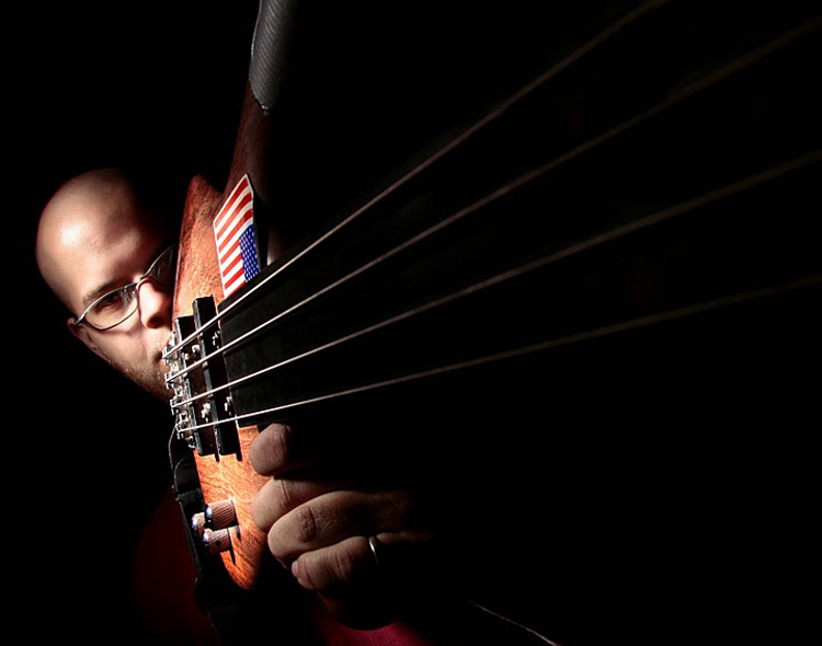
Today’s image up for discussion comes to us from April C. The image above is of a bald guy with a guitar. But its not just any old photo of a bald guy with a guitar. It’s a very well done, editorial style portrait. It has several things going for it, that make it work.
First thing that makes this such a great image is the lighting. The lighting is very fitting for the subject. The lighting is dramatic, with deep shadows, which cut out the entire image. The lighting is also very well controlled. Notice how she concentrated the light on the subject’s face and guitar. From there, the light fades outward. Our eyes naturally go to the brightest area of a photograph. By properly controlling the light, it keeps your eye right where it should be, on the subject.
This image also has a very strong composition. April has done a wonderful job of using dead space, on the right side of the frame. This dark area, along with the guitar strings direct the eye strait to the subject. There are a lot of photogs out there that say its wrong to use dead space. This is only true if you’re going for a very classical portrait, and submitting it for a PPA contest. But this image is anything but classical portraiture. But that’s what makes it so interesting. Its not normal. It has broken the rules. Its outside the box. Its. . . good.
If I were to nit-pick and find something to improve on this image, it would be to add a catch light in the subject’s eye. Now, I realize there is a lot of effort in controlling the light in this shot. It looks like there is only one light being used. It also looks like the light is either shot through a snoot, or a grid spot. And, to use this one light source and get a catch light may completely screw up the lighting of the entire image. So, if you can’t move your light around for this image, you may have to add a second light. This doesn’t need to be much, a small flash at 1/64th power, with a very tight snoot aimed directly at that eye. Some care taken not to catch a reflection in the glasses and you’d have it. Again, this is a very miniscule, nit-picky thing to bring up. It really doesn’t need the catch light, but hey, I had to find something to push the envelope.
As always, this image is now up for comments form anyone who cares to add their opinion, for the betterment of the industry. So, what’d I miss?
Thanks April for subjecting your image to my textual lashings!! You’ve got some great stuff out there, and I’ glad you do what you do! Keep up the good work!
I have to agree with my brother on this one! I enjoy the lighting details very much. Notice that there is nearly no reflection of light. Good work! It could be better if it was an acoustic guitar though....just saying!
ReplyDeleteI like the photo and agree with Todd that a little bit of light in the eye could improve it a bit. One thing that I would suggest would be to drop out his shirt in Photoshop and what I believe is a highlight on his forearm. The red or orange shirt doesn't help the image and the highlight on the bottom of his forearm is the only accented item over in that part of the frame in the dead space and draws my eye over there and makes me wonder what it is and why it is there. They both are there just enough to make you look and wonder and if they were dropped out you could focus on the person in the image more. Good shot. I like it! Especially the angle you have the guitar at so the strings lead you into his face but yet it isn't pointed directly at the camera like we have all seen too many times. Thanks for sharing the photo April.
ReplyDeleteGood point Stephen! I see where you're coming from about the red in the bottom of the frame. If you don't want to take it out completely (it does lend to some symmetry in the top-to-bottom composition), burning it in a little would make it much less "eye catching." Thanks everyone for your your input!
ReplyDeleteI absolutely love the leading lines that the guitar strings bring to the image. They aren't lit in a way that brings them out so boldly that their pattern pulls emphasis away from the subject. Instead, they start in shadow and then the light touches them and they help guide the viewer's eye.
ReplyDeleteI also like the American flag and the duct tape on the guitar. It makes the image more personal and less generic. Those little touches, even if they aren't by the photographer, help to make the image for me and pulls me into it a bit more.
Thanks Beki! Glad to have your 2 cents here. I can lean towards the technical, and sometimes neglect the creative side of things. So its great you lean the other way! I'm so thankful you all are involved in this blog thing of mine. It makes it all the more worth it!
ReplyDelete