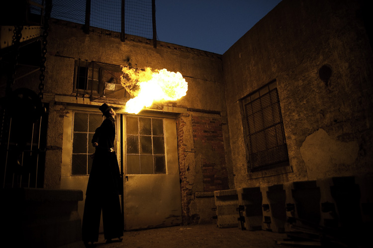
Hello everyone. Here we go with this week’s image critique. This one comes to us again from Stacy F. She sends us a shot of a fire-breathing, stilt-walking, back-alley dwelling, guy. So lets get to it…
Fist off, this image is very striking, very interesting. Immediately, I was drawn into the image, to figure out what’s going on. Nothing like an abnormally tall man spewing fire from his mouth to peak one’s interest. Love it. One thing that will always raise impact level is to shoot subjects seldom seen. I can tell you, with absolute certainty, the number of times I’ve seen a photograph of a guy on stilts breathing fire – three (counting this one). If it were a shot of, say, a squirrel at the park, then it’d be much harder to hold my attention (I saw enough squirrel photos the first week of photog school alone to last me a lifetime). So just by having such an interesting subject you’ve started off with a huge plus. And then there’s the scene. The creepy, decaying, dead-end alleyway is a great place to place your subject. It really gives it that “I’m-lost-and-went-the-wrong-way-down-a-dead-end-alleyway-and-there’s-bars-on-the-windows-and-a-creepy-fire-breathing-carney-in-the-shadows” vibe. It really works with your subject.
The exposure of the image is very well done. You have handled your flash very well. Wait…What? Flash?? That’s right. It may not have as short of a flash duration as, say, an SB-900, but the fire is acting as a flash, illuminating the entire scene. And you’ve exposed for it quite well. You were even able to underexpose the sky by a couple of stops or so, keeping it a dark, rich blue, which is very suitable to the overall image. I also love how the fire creates so much contrast and deep shadows.
Lets talk composition. Here’s where the image could use a little work. The position of the scene is placed nicely within the frame. The angle of the walls framing the sky, the dark shadows to the left and bottom right. So kudos for the composition of the scene. The placement of your subject could use a little work though. As is, its not too bad. But I think if you were to have placed him further into the corner, turned him 180° (facing to the left) and had him blowing the fire towards the left (at the same upward angle), it would have been a stronger image. That would anchor him in the middle of all those great leading lines the building is creating. We could also see his face, which would add some interest as well. Whenever I'm on a shoot like this, I’ll shoot my subject from several different angles and positions, exploring as many options as possible. And maybe you did that. But for this image, a little moving of the image would make it a bit more powerful.
Overall, I really like this image. It has a lot of interesting components. And there’s really only minimal tweaks that I think would help it out. Nicely done Stacy. Keep up the great work!
Now, go out and shoot something!

No comments:
Post a Comment