
Friday, Jenny and I went out to eat, then hit the IMAX to watch Alice in Wonderland in 3D. It was brilliant. The day was beautifully sunny, reaching a delightful 70 degrees. But then it was over and Saturday came. We woke up to 8 inches of snow, and hit a frosty high of 32 degrees. How’s that for the first day of Spring? Gotta’ love Oklahoma weather. But I digress…
This week we have another image from April C. She’s the first to have a second image critiqued. I’m honored that several of you have sent in multiple images for me to scrutinize. From all the feedback, its been a worthy and beneficial exercise. So as long as you keep sending in the images, I’ll keep giving them my two cents.
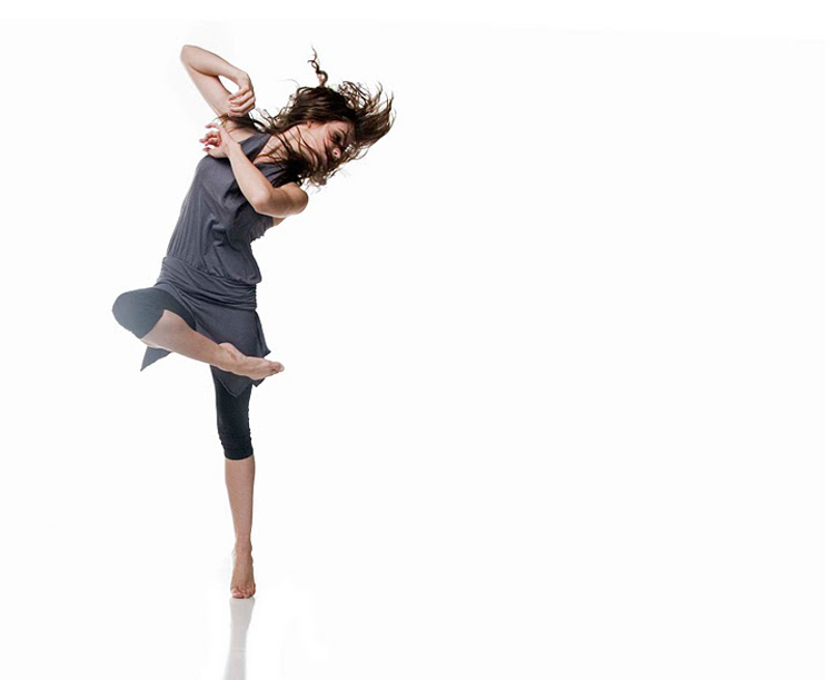
April’s image this week is of a girl dancing, captured on a pure white background. I’d like to start with covering what’s great about the image. First of all, I love the posing of the subject. There’s a ton of movement, showing a good amount of motion. This is perfect for a dancer. I really like the movement of the hair. Its crazy, all over the place, but you can still see much of the subject’s face. I also really like the posing of the subject’s body. Every joint is bent, which adds so much interest to the subject. Overall, the posing is excellent.
Another thing I like is the composition. I am a huge fan of dead space. Maybe its because I tend to have an editorial style to my own work. At any rate, it’s a great use of the extra dead space to the right of the subject. Its perfect for any use – it’d look great framed on the wall; and it’d be great for a magazine spread. It’s very multi-usable (is that a word?).
Now, on to the negative. First of all, the white background isn’t actually pure white. I'm sure its hard to see here on the blog, but there are areas that have a light grey hue. There’s a grey outline around the subject, and a grey line running across the top of the image. This is an easy fix in photoshop. All we have to do is use the dodge tool and clean it up a bit. If you’ve been following the blog for a while, you know how much I preach capturing the image IN CAMERA and not relying on photoshop to fix things. Well, this is one area I think photoshop is essential in creating the image. If you’ve ever shot a white seamless background, you know how hard it is to get it pure white. The lighting has to be perfect. You have to light your subject separately from your background. Then you have to light the background around 1.5 stops brighter than the subject exposure. And it has to be lit very evenly. This is usually done with at least three lights. To get everything perfect is very, very difficult. And even when you think everything is perfect, you open up the image in post only to find the BG is a tad grey. In this type of shooting, its almost a given you’ll be cleaning this stuff up in post. And it’ll take all of 30 seconds to do. So this is one of the few times you’ll here me say “this is an easy fix in photoshop.”
The only other thing that I find problematic is the light spilling over the subjects right leg. It looks as though a BG light is spilling back into the camera, just enough to wipe out the contrast on that leg. This is something that could have been fixed on set with better placement of a flag to block the light spill. But say you didn’t notice it while shooting (slow down), this too can be fixed in photoshop. Just burn it in a little and you’ll have your contrast back. But this just adds time at the computer fixing stuff, instead of using that time for creativity.
Overall though, you’ve captured a great image April! Thanks for sending it in. If anyone has anything to add, leave a comment.
Now, go out and shoot something!
This week we have another image from April C. She’s the first to have a second image critiqued. I’m honored that several of you have sent in multiple images for me to scrutinize. From all the feedback, its been a worthy and beneficial exercise. So as long as you keep sending in the images, I’ll keep giving them my two cents.
April’s image this week is of a girl dancing, captured on a pure white background. I’d like to start with covering what’s great about the image. First of all, I love the posing of the subject. There’s a ton of movement, showing a good amount of motion. This is perfect for a dancer. I really like the movement of the hair. Its crazy, all over the place, but you can still see much of the subject’s face. I also really like the posing of the subject’s body. Every joint is bent, which adds so much interest to the subject. Overall, the posing is excellent.
Another thing I like is the composition. I am a huge fan of dead space. Maybe its because I tend to have an editorial style to my own work. At any rate, it’s a great use of the extra dead space to the right of the subject. Its perfect for any use – it’d look great framed on the wall; and it’d be great for a magazine spread. It’s very multi-usable (is that a word?).
Now, on to the negative. First of all, the white background isn’t actually pure white. I'm sure its hard to see here on the blog, but there are areas that have a light grey hue. There’s a grey outline around the subject, and a grey line running across the top of the image. This is an easy fix in photoshop. All we have to do is use the dodge tool and clean it up a bit. If you’ve been following the blog for a while, you know how much I preach capturing the image IN CAMERA and not relying on photoshop to fix things. Well, this is one area I think photoshop is essential in creating the image. If you’ve ever shot a white seamless background, you know how hard it is to get it pure white. The lighting has to be perfect. You have to light your subject separately from your background. Then you have to light the background around 1.5 stops brighter than the subject exposure. And it has to be lit very evenly. This is usually done with at least three lights. To get everything perfect is very, very difficult. And even when you think everything is perfect, you open up the image in post only to find the BG is a tad grey. In this type of shooting, its almost a given you’ll be cleaning this stuff up in post. And it’ll take all of 30 seconds to do. So this is one of the few times you’ll here me say “this is an easy fix in photoshop.”
The only other thing that I find problematic is the light spilling over the subjects right leg. It looks as though a BG light is spilling back into the camera, just enough to wipe out the contrast on that leg. This is something that could have been fixed on set with better placement of a flag to block the light spill. But say you didn’t notice it while shooting (slow down), this too can be fixed in photoshop. Just burn it in a little and you’ll have your contrast back. But this just adds time at the computer fixing stuff, instead of using that time for creativity.
Overall though, you’ve captured a great image April! Thanks for sending it in. If anyone has anything to add, leave a comment.
Now, go out and shoot something!
I agree with Todd. I like the image and especially the use of dead space...it works well.
ReplyDeleteThe thing that my eye keeps going back to is the (as Todd put it) "light bleed on the subjects right let". Although I agree that it needs correcting, I don't know if I agree on what is causing it. If it were truly a halation problem caused by the background bleeding into the subjects pixels, I believe this problem would extend to other areas of the image. Instead, it looks to me to be more of a lens flare. This could easily be fixed with a flag/gobo/card (or whatever you want to call it!) between the light and camera to keep the light from hitting the lens. While the background isn't pure white, it is even in tone throughout (except for the top which is pure white) which would make it even easier to correct in post.
Good image that with a little correction could be just a bit better. Nicely done.
Who said anything about "halation from the background?" You said exactly what I was saying. Maybe "bleed" wasn't the best word to use. I'll go back and change that to "spill" to keep from any confusion. =)
ReplyDeleteWell good for you for correcting yourself to remain accurate. We sure don't want any confusion on here by people using the wrong words, do we? haha
ReplyDeleteThis comment has been removed by a blog administrator.
ReplyDeleteThanks for the critique! Love to learn! Keep up the spectacular work!
ReplyDeleteYou're very welcome April!!! So glad you're checking in from time to time. We should hang sometime, with our cameras maybe.
ReplyDelete