
Good morning everyone. Time for another image critique. This week’s image comes to us from Brad V. Brad came across the blog while reading the discussion board on Jasmine Star’s facebook page. That’s one of the many places I stay plugged into in the greater photography community, giving back as much as I can. Brad told me he’s new to photography, and would appreciate any advice I (we) could give.
First off, I’d like to reiterate that I do not take these critiques lightly. I offer them for one purpose: to help others improve. I never mean to offend, but neither will I sugar-coat my thoughts. So, with that said, lets get to it.
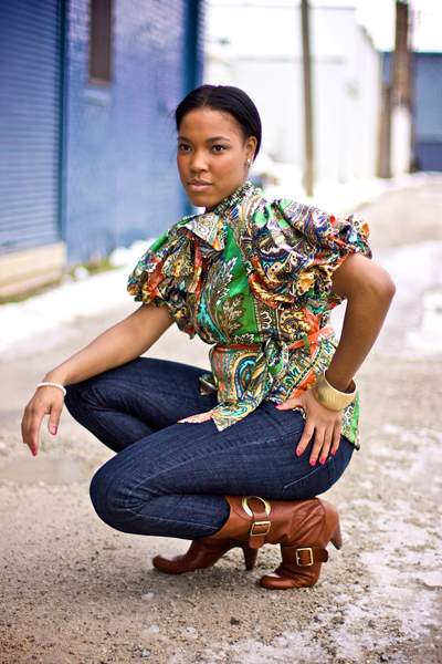
The image is a sort of a fashion shot of a woman in an alley. Overall, I think the image is pretty well done. It looks to be shot in available daylight, exposed well. Whenever we use available daylight, shooting in the open shade works well for portraiture. If we shoot in direct sunlight, the highlights can be too harsh and the shadows too dark. The open shade gives us that nice diffused light, resulting in a nice buttery skin tone. It was a great choice for this shot.
Next lets look at the composition. Overall the crouching position of the subject works well. If the image is intended as a portrait, one thing that would make it stronger would be to have the subject’s eyes looking at the camera. In portraiture, eyes are a person’s most important feature. They are the window to the soul. With the eyes looking to the camera, it would solidify a deeper connection with the viewer. It would draw the viewer into the image, and more than that, into the subject herself. The pose is pleasing, but eye contact would give greater impact to the image. On the other hand, if the aim is to showcase the outfit, a fashion shot, the eyes are much less important. In fact, by having the eyes looking away from the camera, the viewer is inclined to stay focused on the clothing, which is what you want in a fashion shot. The subject’s expression is fine overall, but depending on whether it’s a portrait or fashion, the eyes could be recomposed.
One thing that bugs me, just a little, is the subject’s left hand. This is a nit-picky thing to mention. But it seems a bit awkward. Perhaps moving the hand up to the waist, rotating the wrist so the thumb points towards her back, would look more natural. But again, this is a nit-pick. I only mention it to keep us continually thinking.
The next thing concerning the composition I’d like to discuss is the background. I like the alleyway. It’s a nice contrast to the beauty of the subject. But the placement of the subject needs to be adjusted. I’m can’t help but notice the dark line running through the subjects head. There’s a nice, dark blue building that abruptly stops and turns to bright white right behind the subject’s head. One thing we could do is move the camera around to the right, filling up the entire background with the dark blue building. This would give a consistent color behind the subject, which would be less distracting. Now, of course I have no idea what is to the left, if it would even be possible to do this. But assuming the blue building continues, this would be a much more pleasing background.
Lets say, however, something prohibited us from moving the camera, and this angle is all we have to work with. Another thing we could do is center our subject’s head between the blue building and the telephone pole. This would better frame our subject’s head. If there isn’t enough room, and I cringe as I type this, we may have to do a minor bit of photoshop to remove the pole. I cringe because we must strive to capture the perfect image in the camera. We should NEVER rely on photoshop to fix sloppy photography. Slow down, think it through, take the shot. More times than not, we are able to fix any problems we have, before we shoot it. If we commit to being disciplined in this manner, we are then able to use photoshop for creativity, not for fixing poor photography. (okay, stepping down from the soap box now…) If, as a last resort, we have to remove the telephone pole in post production, at least there wouldn’t be anything intersecting her head – always a plus =).
All in all Brad, you’ve succeeded in creating a nice image. If you are new to the craft, you have a good eye on which to build. Keep up the great work and check in from time to time to let us know how things are going!
Aside from all that you said, which, by the way, is everything I was thinking when I first saw the image...
ReplyDeleteI'll throw in a lot of positives about this image. If this guy is new to photography like he says, this image is superb. Really, it's more so what isn't in and on the image that I love. There's no actions, no over-editing. It has some great contrast and a very good, albeit a tad bit pink, white balance. It's so pure. I love the near complementary colors of her blue pants and brown-orange boots. That is absolutely fabulous.
I do feel that her face is more out of focus than the rest of her and there is a small hint of a sharpening halo.
Coming from a beginner photographer, this image shows a lot of promise. And I do mean a lot!
I too would like to commend a new photographer on a very nice beginner photo!
ReplyDeleteI agree with all that has been said about this photo. The thing that bothers me the most is the models left arm sticking out at that awkward angle...the elbow is too high for how far her abdomen is turned from the camera creating an angle across her shoulders that makes her head look a bit twisted and misplaced. All in all, the image is a nicely done fashion shot.
Brad, keep after the craft and stick to your guns. Don't let anything bring you down and continue to learn all you can and create photographs that will amaze people. Good luck!
Stephen,
ReplyDeleteThanks for the input! One thing I like about my image is the placement of her right hand. I think it looks natural the way she has it resting off her knee. If i were to redo this pose with everything else the same (squating, right hand, head position, etc.), what would you recommend would be a good position for the left hand?
Thanks again,
Brad
Anytime! You are correct when you say that her right hand looks natural. It has a nice flow (the elbow, wrist, and fingers are all bent). One thing that would help the left arm would have the elbow bent at less of an angle (less bend to it) and to move her hand further down her leg. The way she is currently positioned, it seems as if she might be holding herself due to some pain she might be in. Move her hand down her leg and rotate her wrist so that her fingers are going away from the camera. This will change the harsh angle of her elbow, correct the awkward angle her shoulders are at, and break up the straight line that her arm is currently creating (you can draw a straight line all the way from her elbow to her fingertips). The general rule with joints (especially when photographing women) is "if it bends, bend it".
ReplyDeleteHope that made sense...feel free to stay in touch!