
Happy Monday everyone. For those of you who have been following the blog, you undoubtedly noticed I skipped Friday's post. I had an incredibly busy week/weekend, and simply didn't have the time to get onto my computer. Sorry about not posting it, but it was great to be busy =).
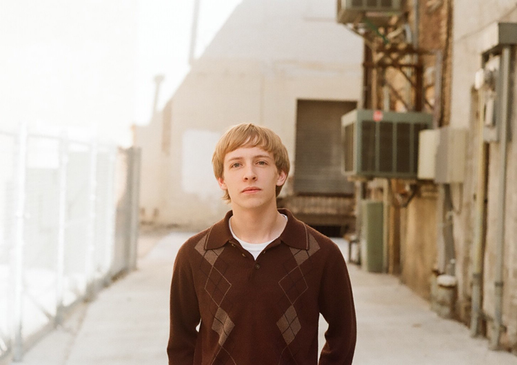
This week's image up for critique comes to us from my buddy Garret D. from Springfield, Mo. He's fairly new to photography, but has developed quite an eye. The image he sent is one from his very first senior photo session, shot just a few weeks ago. And if I remember correctly, he shot it on film - actual, 35mm negative print film. Garret shoots a great deal of his work on film, because it fits his style. Good for you Garrett. Way to stick to your guns. So lets get to it...
Overall, especially for a first senior session, the image is pretty well executed. We all know, posing/directing our subjects is difficult. And multiply that ten times over when it's a person we don't know. I still struggle with engaging, directing, and posing my subjects. I am much better than when I began, but I still have a long way to go in my "directing" skills. Natural people skills are a plus, but directing a subject on a shot demands something more. If we are going to be photographing people, then we must be committed to developing our directing skills. And this comes largely from experience. In this image, the subject's expression is very good. He looks relaxed, and is engaging the viewer. Best of all, it looks like something is going on in his mind. With this sort of expression, it wouldn't be much of a stretch to get a blank, unengaged look. So nice job on that.
Aside from some problems with the composition, which I'll touch on in a moment, I like the use of leading lines. The bottom of the fence on the left, and the bottom of the wall on the right lead the eye right into the subject. This, too, was well done.
Lets look at a few things that could improve the image. The first thing I'd like to mention is the subject's pose. Generally, it makes for a more pleasing pose to angle the shoulders one way or the other. This would create an angle to the subject's shoulders, and project a more interesting pose. Also, whenever the shoulders are squared to the camera it widens the subject, which isn't so bad for males, but not usually appreciated by the ladies (for the most part, the squared shouldered pose here isn't bad. It works pretty good. BUT, it may be a bit stronger to angle 'em. I mention this mostly for the sake of discussion).
The next thing I'd like to point out is the composition. Notice how the subject's head is smack in the middle of the frame. It would be a stronger image if you were to drop the camera so his head is in the upper third of the frame. THEN, turn the camera to the right, so the subject is in the left third of the frame. You would still have the leading lines of the wall, which would still lead the eye to the subject. Also, by turning the camera to the right, you would nearly eliminate the blown-out highlight area on the left side of the frame. This bright area is somewhat distracting, drawing the eye away from the subject. Shooting in the open shade of an alleyway is a great place for a shoot (I shot several frames this way in downtown Tulsa just yesterday). But you have to be careful of the contrast between the shade and direct sunlight. If both areas are in the frame, exposing for the shade will likely blowout the area in the sun. Adversely, if you expose for the sunlit area, your subject will probably be too dark. It makes life much easier if you avoid this mix of lights in your frame, if you can help it.
But lets say, you shot it this way, and this is the image you have to work with (I end up in this scenario more times than I'd like to admit). What can we do? One thing we can do, without going into a ton of fancy-pants photoshopping is to crop down some. With this image, we can still achieve the above results simply by cropping the image. Here's what I'm talking about:
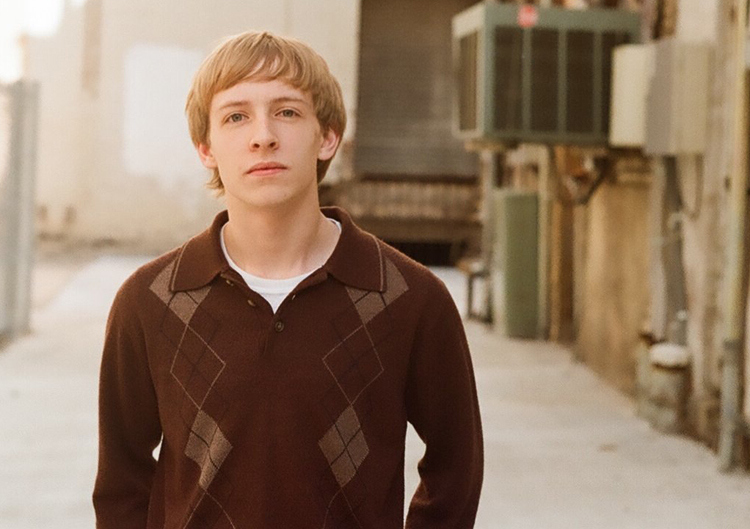
Notice how the subject is to the left of the image, and his head is now towards the top of the frame. Also, the bright area has been greatly reduced, much less distracting (Thanks Garrett, for letting me hack your photo). =)
One last thing to watch out for is things in the background behind your subject. Notice how the doorway to the right of the subject's head comes very close to intersecting the head. Its great that it doesn't, but would be that much better if there were more separation between the two.
Overall, Garrett, its a great first senior photo! And, having seen many of the others from the shoot, you did an outstanding job! Thank you for letting us see and discuss your work. We look forward to seeing more of your stuff as you continue to pursue your photography. Keep it up!
Now, go out and shoot something!
This week's image up for critique comes to us from my buddy Garret D. from Springfield, Mo. He's fairly new to photography, but has developed quite an eye. The image he sent is one from his very first senior photo session, shot just a few weeks ago. And if I remember correctly, he shot it on film - actual, 35mm negative print film. Garret shoots a great deal of his work on film, because it fits his style. Good for you Garrett. Way to stick to your guns. So lets get to it...
Overall, especially for a first senior session, the image is pretty well executed. We all know, posing/directing our subjects is difficult. And multiply that ten times over when it's a person we don't know. I still struggle with engaging, directing, and posing my subjects. I am much better than when I began, but I still have a long way to go in my "directing" skills. Natural people skills are a plus, but directing a subject on a shot demands something more. If we are going to be photographing people, then we must be committed to developing our directing skills. And this comes largely from experience. In this image, the subject's expression is very good. He looks relaxed, and is engaging the viewer. Best of all, it looks like something is going on in his mind. With this sort of expression, it wouldn't be much of a stretch to get a blank, unengaged look. So nice job on that.
Aside from some problems with the composition, which I'll touch on in a moment, I like the use of leading lines. The bottom of the fence on the left, and the bottom of the wall on the right lead the eye right into the subject. This, too, was well done.
Lets look at a few things that could improve the image. The first thing I'd like to mention is the subject's pose. Generally, it makes for a more pleasing pose to angle the shoulders one way or the other. This would create an angle to the subject's shoulders, and project a more interesting pose. Also, whenever the shoulders are squared to the camera it widens the subject, which isn't so bad for males, but not usually appreciated by the ladies (for the most part, the squared shouldered pose here isn't bad. It works pretty good. BUT, it may be a bit stronger to angle 'em. I mention this mostly for the sake of discussion).
The next thing I'd like to point out is the composition. Notice how the subject's head is smack in the middle of the frame. It would be a stronger image if you were to drop the camera so his head is in the upper third of the frame. THEN, turn the camera to the right, so the subject is in the left third of the frame. You would still have the leading lines of the wall, which would still lead the eye to the subject. Also, by turning the camera to the right, you would nearly eliminate the blown-out highlight area on the left side of the frame. This bright area is somewhat distracting, drawing the eye away from the subject. Shooting in the open shade of an alleyway is a great place for a shoot (I shot several frames this way in downtown Tulsa just yesterday). But you have to be careful of the contrast between the shade and direct sunlight. If both areas are in the frame, exposing for the shade will likely blowout the area in the sun. Adversely, if you expose for the sunlit area, your subject will probably be too dark. It makes life much easier if you avoid this mix of lights in your frame, if you can help it.
But lets say, you shot it this way, and this is the image you have to work with (I end up in this scenario more times than I'd like to admit). What can we do? One thing we can do, without going into a ton of fancy-pants photoshopping is to crop down some. With this image, we can still achieve the above results simply by cropping the image. Here's what I'm talking about:
Notice how the subject is to the left of the image, and his head is now towards the top of the frame. Also, the bright area has been greatly reduced, much less distracting (Thanks Garrett, for letting me hack your photo). =)
One last thing to watch out for is things in the background behind your subject. Notice how the doorway to the right of the subject's head comes very close to intersecting the head. Its great that it doesn't, but would be that much better if there were more separation between the two.
Overall, Garrett, its a great first senior photo! And, having seen many of the others from the shoot, you did an outstanding job! Thank you for letting us see and discuss your work. We look forward to seeing more of your stuff as you continue to pursue your photography. Keep it up!
Now, go out and shoot something!
I agree with everything Todd said. When I first pulled up the page and saw the image, I immediately thought "that needs to be cropped". So I am glad that Todd mentioned that and showed how it would look. As Todd said, the thoughtful expression on the subject's face is nice. I think the effect could have been a bit more effective if he wasn't looking directly into the camera. All three of our directionally controlling facets (shoulders/body, head, and eye direction) are pointing the same way, right into the camera. Generally speaking, the image looks better and the subject looks more natural when these directions are varied between the three.
ReplyDeleteI love the neutral tones in this image. Greens, khakis, browns, dim whites. Love that.
ReplyDeleteHowever, my eyes kept playing ping pong with the boy (who is supposed to be the main subject) and the green boxy vent thing behind him. I kept looking from him to it then back to him and so on. When you're shooting a vertical subject horizontally you have to be very mindful of the background.
I personally don't mind that the boy is looking directly at the camera and there's little variation. It seems very confrontational and deep yet the slightest bit apathetic and much less posed. A typical yet charmingly natural teenage boy's stance.
I think that the crop of the image does not help in an exponential manner, really (that green box thingy is still there D: ). I think that this type of image would be much better suited in a square crop.
p.s.
FILM YAY! :)