
Happy Tuesday everyone. . . Lets get to this week's critique.
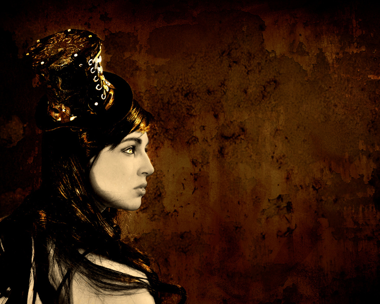
This one comes again from Stacy. The image is of a girl in a hat. This one is very heavy on the graphic side, as a apposed to a straight photograph. I must say, I love this image. Very well executed.
First off, the lighting is handled very well. The high level of contrast between the face and hair is very suitable for this type of image. The deep shadows keeps a level of "darkness" to the image that perfect for the image. As always, the lighting is what makes this image what it is. Use broad lighting and low contrast, and the image looses its impact. The expression on the subject works well. And the hat. . . the hat is a great detail, adding so much interest to the subject. Adding the hat to the subject took the interest level up several notches. Without it, the image would still be great, but with it, its on a whole other level. So bravo on the decision to use the hat.
As you all know, I love compositions heavily weighted to one side. So its no surprise that I really like the composition here. The dead space to the right of the subject adds so much interest to the overall image. Shoot it as a tight, portrait (vertical) composition, and it looses a lot of its impact. So shooting it as a landscape (horizontal) composition was a good decision (in my opinion anyway).
A few more things I like about the image: first) the textured background. Its only adds to the interest of the image. Nothing like a gritty, decaying wall to add interest to any image. B) the coloring of the image. The overall "rusty" look is awesome. And 3) whatever you did to the eyes. . . love it! It may be hard to see on the blog, but the sharp, golden eye "pops" really well out of the rusty surroundings.
Now, on to some things to consider that could make the image stronger. The first thing I think would help would be to add a hard accent, or edge light to the back side of the subject. Not to illuminate the entire left side, I like the deep shadows. But just a little rim light on the back edge of the subject would help separate her from the background. Also, the light on the front of the hat, on the laces is a bit too bright. This is the brightest area in the image, thus pulling the eye to that spot. Now, if you intended to focus on the hat, then I'd leave it alone. However, if you intend ed for the girls to be the true subject of the image, then her face, particularly her eye, should be the focus. So, if you couldn't (or overlooked) modifying the amount of light hitting the laces, then you should burn them down in post production. Darkening that area would allow the eye to be the brightest area, and thus drawing the eye more naturally to that spot.
Overall, this image is stellar, a very striking image. Keep it up Stacy, you're on your way to becoming a huge part of the photographic community! Thanks for sharing your work with us. I look forward to following your work.
As always, anyone reading this is welcome to chime in on Stacy's image. So what's your opinion? What'd I miss? Feel free to offer your opinion in the comments! Also, if you have any images you'd like for me to give my opinion on, you can e-mail them to me at toddwalkerphotography@gmail.com. I only use them on the blog, for the critiques, and for the purpose of helping the photographic community improve. I also do not use last names, or link any image to your website. This is so your clients won't come across my critique through google, who sees all and knows all. The last thing I want is for you to loose potential clients because they saw a critique of your work, even though you are using the input to improve your craft. So, I am vague as to who send in the images.
Now, go out and shoot something!
Thanks Todd for all the compliments, and the help. :) Just to put it out there, the back ground, overall rusty coloring, and the coloring of the eye is all a texture (or 5). I just erased what I didn't want to be rusty, or to look like the background. It's not to hard, just time consuming.
ReplyDeleteI agree with most of what you said, but I have such a difficult time calling this a photograph or digital image. To me, this is more so digital art. Whenever textures are involved, the line between digital art and photography becomes more and more blurred. So, by competition standards, this would not be judged as a digital image. Instead, it would fall under computer art.
ReplyDeleteAll of that aside, I love the warm color scheme. It's consistent throughout the image and ties it all together quite nicely. Great choice of colors for the mood as well.
Great image! My favorite part is the warmth in the highlights. The bottom left of the image seems to be lacking the vignette that the rest of the image has...just sets the balance off a bit to me. I also agree that there needs to be another light from the left to give some more accenting highlights.
ReplyDelete