
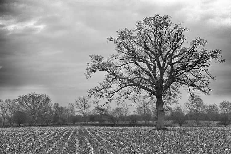
This week’s image critique comes to us again from Brad V. The image is of a tree standing in a cut crop field, in black and white. So lets get to it…
First off, the image is composed pretty well. The tree, which is the subject of the image, is placed in the right third of the frame. As a general rule, it is much more pleasing to break the frame into thirds, and then place the subject of a photograph in on one of those planes. Sometimes, rules need to be broken, but for this shot, it was rightly followed. Had the tree been placed in the dead center of the frame, the overall image would loose much of its interest.
One that would have helped the composition would be to use the leading lines of the crop rows. Notice how the lines created by the crops in the lower left of the frame lead your eye into the image. Now, picture the base of the tree at the pinnacle of those lines. The viewer’s eye would be lead right up into the subject of the photo. But, wait, you can’t transplant a grown tree, so how would you make this happen? Well, assuming that all the crops in this field were planted in rows, you could have walked further to the right until the tree was in line. It may mean your subject would have to be in the left of the frame, but it would allow you to further draw the eye to your subject. The way it is now, these lines compete with the tree, the subject of the image. Its not necessarily bad, but could be that much better using the crop rows.
I really like the heavy use of grain in the image. It adds a good amount of texture to the image, giving it more depth. It has an “old-school-photo-shot-50-years-ago” feel, which adds to the “fine art”-ness of the image.
I like the choice to use Black & White. However, it seems to be more Dark Grey & Light Grey, instead of black and white. In other words: Its Flat. It simply needs more “pop”. You can adjust the levels from this:
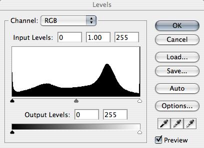
To this:
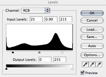
Notice that I just pulled in the sliders from the left (shadows) and right (highlights), and moved the middle slider (contrast) to the right. The made the image pop off the screen (I didn’t post the adjusted version because I didn’t obtain permission from Brad to publicly “hack” his image). Whenever creating B/W images, they really need to have areas of deep black and bright whites. This way the images have more impact, more “umph” to the viewer. Black and white images need to smack viewers in the face. And this image falls just a little short of that.
The biggest problem this image has is the white halo-ing around all the tiny branches of the main tree (which is near impossible to see here on the blog). I'm not sure what happened here, but its just too distracting. It looks as though you needed to darken the sky, using the magic wand tool in photoshop to select it, then darkened the selected area. The problem though, is this always leaves an edge around whatever is selected. This can be “fixed”, but it would take an insane amount of time to go around every little twig, darkening the halo. This could have been captured in camera using a Circular Polarizer (or, since shooting B/W, maybe an 80A filter). A Circular Polarizer polarizes stray light in the sky, darkening the blue, and giving more contrast to the clouds. And it does nothing to the colors of a scene. But, it is dark, which forces a slower shutter speed by a couple of stops, maybe causing the need for a tripod, so be aware of that.
Overall, this image is pretty good. But it needs a little work to get it to the next level; the level that really “wows” people. Thanks for sharing your image with us Brad! I hope I’ve given you some things to help you along. You’ve been doing some great work, and you seem to be improving, so keep it up!!
Now, go out and shoot something!
My mood isn’t dramatically altered with the image as is, at least not as what I believe the photographer intended. Aside from what has been said, I think there needs to be more of a depth within the shades and a larger scale of greys. As is, the sky and the ground are very similar in shade. The only dramatic difference we have in the greys take place in the tree, but it’s competing with the lines in the bottom left and the haloed tree that is also located in the bottom left.
ReplyDeleteI would like to see two graduated filters applied to the sky, one from the diagonal left and one from diagonal right to really bring the sky down. Then the contrast increased to make the lighter lines of the field crops pop more.
To me, the “grain” in the corners of the image look more like color clipping from grayscale or color mixing, but with the image at its current size, I can’t be definite.
The ground, the tree, and the sky are three major components of this image. And they all need special attention paid to them to bring them out, but only in a matter that puts emphasis on what the artist intended.
Black and white is an art form all on it's own, but the artist is on the right path;)