
Hey everyone. I've got a bit of a curve ball to throw at you. This week, instead of me critiquing one of your images, I would like your thoughts on one of mine. So those of you who read the blog, especially those of you who've had images critiqued on here, I'd really like to get your input. So, for the image above, give me your critique in the comments below. I can't wait to hear what you have to say!
Also, I'll have my regular post on thursday, but I will be posting some of my work from the previous month on Friday. It's time again for First Friday Photos!! so be on the lookout for that!
Now, go out and shoot something!! (right after critiquing my image) =)
Todd, I like the idea for this week's critique so....here we go!
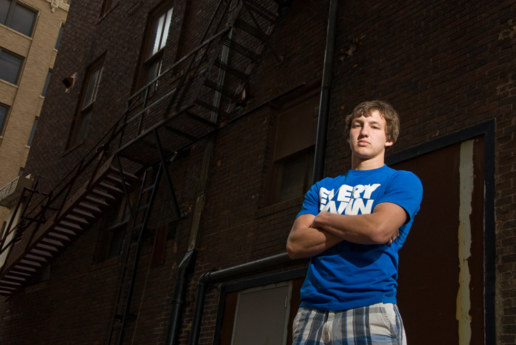
ReplyDeleteNot a bad background choice for the subject to contrast color. He looks comfortable although he does seem to be crooked in the frame. I see that you shot it straight for the background (the door on the right side of the frame is straight) but I think you need to keep in mind the the background (door) is not the subject. I re-cropped the image with the guy straight and it looks much better to my eye. The door is a bit crooked this way but who cares? It also eliminates the harsh angle the left side of the red building has and the lighter building behind it (which I would also crop out...).
The flash on the guy is a bit overdone for my taste and doesn't really match the environment in quality or intensity. Turn the flash down a bit and it will open up the background and look more natural (less like there was a flash). The angle of the flash looks good and the from the top but is coming from the opposite direction than the environment (look at the highlights on the pipes in the background). This isn't necessarily a bad thing will fill flash but since you completely lit the him with the flash (main light) it does bug me.
Good expression on him though. With shooting up at him and the look on his face you really get the domineering and confident feel from the image. I like the mood of the image overall but a bit of tweaking could make it all the better.
Thanks for sharing!
Hi Todd! Look I'm numero UNO!!!! =o
ReplyDeleteI like this image for the most part. There are just a few things I would have done differently in post. I would have cropped a little bit closer on the left side. The tan building pulls me away from the subject because it is quite a bit brighter then the main building. Second, I would have burned in the window on the top left... well you know that bright one, for the same reason as I would have cropped out the other building. And third I would have clone stamped out out the painted line on the door behind your subject. I think that could be debatable, but I just feel it competes with your subject especially being so close. Overall like I said, good image. :) And I love his blue shirt! It really makes him stick out!
--Stacy Kay
This comment has been removed by the author.
ReplyDeleteGreat comments You two!! I completely agree with what the both of you have said!! Overall, I like the IDEA of this image, but I just didn't get it to match my vision. Mainly because I was battling my arch enemy: being in too-big-a-hurry!! I thought it would be a good image for critique. I was wishy-washy about it. I knew what I had in my mind's eye, and I wanted it to be more than it was. But, the final image just had problems, as you both pointed out. I did finally get a better light balance, and better crop in-camera (you can see it on the First Friday Photos, posted today, May 7th). But then, after getting a better "look" to the image, I forgot to go back and take the non-smiling shot I also wanted. Thank you so much for "giving back," and critiquing my work. Together, we become better!
ReplyDeleteI'll just be the art nerd here and comment on the colors.
ReplyDeleteI love the blue against the brown, great complementary colors working there.