
Hello everyone. Welcome to the new blog schedule. In case you missed it, business has been picking up, which means my time has become more scarce. So, in an attempt to keep my life balanced, I'll only be posting twice a week until further notice. Tuesdays will be critiques, and Thursdays will be technique and your questions answered. So keep sending in your images and questions, I'll still be offering my two cents. I'll also continue to post my work the first Friday of every month.
This past Sunday, I was glad to finally get out and shoot FOR FUN! Its funny how so many of us begin in photography for the pure enjoyment of it. But then we begin to make a living at it. And before we know it, though its still a lot of fun, we find ourselves shooting for everyone else but ourselves. I'm finding I have to fight for the opportunity to just go out and shoot for the fun of it. Sunday, there were six of us, plus my wife and daughter, who met downtown just for the fun of it. And, despite being very late (my daughter is 21 months old), and only shooting for an hour or so, it was great fun. Afterwards most of us even went out to eat (thank you Beki for diner!). I'm looking forward to doing this more and more. It helps my creativity to shoot for no one but myself. I'll be sure to let you know when our next GOYA shoot is, and hopefully more of you can join us. =)
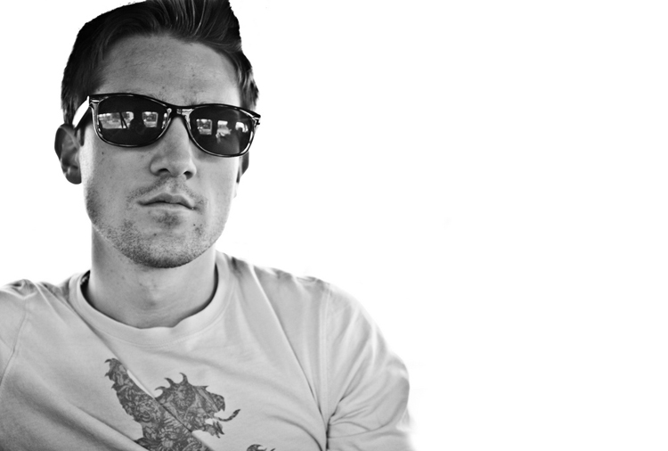
Now, on to this week's image critique. This shot is sent in to us again from Nikki C. The shot is of a dude with some spiffy sunglasses on.
Overall, I think this image is pretty well executed. Most of the images I've been getting for the critiques have been very good, its been difficult to find much to improve on. And such is the case with this one. Being an editorial portrait photographer myself, I love the composition of this shot - subject heavy to the left, lots of dead space to the right, perfect for type. Of course, this is my style, and not everyone is gonna give the composition the same love I do. And that's okay. If we all saw everything the same way, and created everything exactly the same, photography would be a terrible thing. Ugh, the thought of that is almost to horrible to bear. . . anyway, back to the critique. . .
I also really like the stoic expression of the subject. It goes well with the shades. The reflection in the glasses is also nice; it adds to the interest of the image. I find myself trying to figure out what's going on in the reflection - where is he, what's he looking at, etc.
Lets discuss a few things that could make the image a bit stronger. I love the pure white background. But, judging by the dude's hair, the background was dropped out in post. This, of course is fine, it makes a great image, but the edge around the subject needs to be a bit cleaner. Its very difficult to see on the web, but his left jaw line, and all along his hair is a bit jagged. So watch out for that.
Another thing that could be tweaked is the contrast. The subject is a little flat. The skin tone and shirt are a little too grey. As is, its not bad. But boosting the contrast will give it just enough "pop" to take it to the next level.
Overall this shot is well done. A couple of tweaks and it'd be that much better. Nice job Nikki! Keep up the good work!
Anyone have anything else to add? Feel free to post a comment below. Also, let me take another opportunity to say to anyone out there, you are welcome to send in your images for critique at toddwalkerphotography@gmail.com . Also e-mail me any photography related questions and I'll do my best to answer anything I can. I'm not the end-all authority on photography, but together we all can help each other improve our craft.
Tune in Thursday for the next post. Until then...
Go out and shoot something!
This past Sunday, I was glad to finally get out and shoot FOR FUN! Its funny how so many of us begin in photography for the pure enjoyment of it. But then we begin to make a living at it. And before we know it, though its still a lot of fun, we find ourselves shooting for everyone else but ourselves. I'm finding I have to fight for the opportunity to just go out and shoot for the fun of it. Sunday, there were six of us, plus my wife and daughter, who met downtown just for the fun of it. And, despite being very late (my daughter is 21 months old), and only shooting for an hour or so, it was great fun. Afterwards most of us even went out to eat (thank you Beki for diner!). I'm looking forward to doing this more and more. It helps my creativity to shoot for no one but myself. I'll be sure to let you know when our next GOYA shoot is, and hopefully more of you can join us. =)
Now, on to this week's image critique. This shot is sent in to us again from Nikki C. The shot is of a dude with some spiffy sunglasses on.
Overall, I think this image is pretty well executed. Most of the images I've been getting for the critiques have been very good, its been difficult to find much to improve on. And such is the case with this one. Being an editorial portrait photographer myself, I love the composition of this shot - subject heavy to the left, lots of dead space to the right, perfect for type. Of course, this is my style, and not everyone is gonna give the composition the same love I do. And that's okay. If we all saw everything the same way, and created everything exactly the same, photography would be a terrible thing. Ugh, the thought of that is almost to horrible to bear. . . anyway, back to the critique. . .
I also really like the stoic expression of the subject. It goes well with the shades. The reflection in the glasses is also nice; it adds to the interest of the image. I find myself trying to figure out what's going on in the reflection - where is he, what's he looking at, etc.
Lets discuss a few things that could make the image a bit stronger. I love the pure white background. But, judging by the dude's hair, the background was dropped out in post. This, of course is fine, it makes a great image, but the edge around the subject needs to be a bit cleaner. Its very difficult to see on the web, but his left jaw line, and all along his hair is a bit jagged. So watch out for that.
Another thing that could be tweaked is the contrast. The subject is a little flat. The skin tone and shirt are a little too grey. As is, its not bad. But boosting the contrast will give it just enough "pop" to take it to the next level.
Overall this shot is well done. A couple of tweaks and it'd be that much better. Nice job Nikki! Keep up the good work!
Anyone have anything else to add? Feel free to post a comment below. Also, let me take another opportunity to say to anyone out there, you are welcome to send in your images for critique at toddwalkerphotography@gmail.com . Also e-mail me any photography related questions and I'll do my best to answer anything I can. I'm not the end-all authority on photography, but together we all can help each other improve our craft.
Tune in Thursday for the next post. Until then...
Go out and shoot something!
First off, I love the composition of the shot!! I too am really big into weighting the subject to one side or the other (I do this a lot in my portraiture). I love how the glasses, his hairstyle, t-shirt, and the expression on his face all work together.
ReplyDeleteBefore I read your critique Todd, I noticed the reflection in the sunglasses makes it look like the subject is in a car or a van of some sort (you can see a seat belt in the reflection). This sort of bothered me only because it straightaway made me think the background was taken out in post processing. Then when you mentioned the hair line, I saw it too. I definitely like that there is something going on in the reflection of the glasses. I am curious to know what it would look like with leaving the background in or blurring it to make it look like a moving car (if he is in fact in a car of some sort).