
Alright let get back into the swing of things with another image critique. If you’re new to the blog, read the first few paragraph's on THIS post to see where I’m coming from concerning these image critiques.
Today’s image has been sent to us by Keith. Thanks, Keith, for being patient over the last several weeks while I was, **cough cough**, absent from posting. Okay, lets get into it…
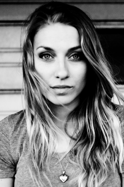
First off, lets talk about the composition. It’s a well done headshot. Following the “rule of thirds,” the subject’s eyes are positioned on the top third of the frame. I really like the movement of the subject’s hair – very natural. The background is pretty good. I might have moved the subject a little to the left, getting rid of the black void tot the right of her head. But its not too bad; a mere nit-pick really. The lighting is well handled, and exposure is spot on.
There are a couple of aspects of this image that I think are simply golden. You absolutely nailed the subject’s expression. I love the pleasant eyes, the slightly open mouth – the entire expression is great. The eyes are perfectly engaged with the camera. The eyes are the single most important part of any portrait, especially a headshot, and even more so when they are looking into the camera. And you nailed it! If the eyes aren’t engaged, then you’ve lost it. Think of it this way, lets say you had this exact image, only the eyes were at mid-blink. The shot would be ruined. As the old saying goes, “the eyes have it” (or something like that). The expression and the eyes are what make this such a strong image. Nicely done.
Now lets discuss how the image might improve. As photographers, we should continually be stretching ourselves, looking for ways to improve what we create. So what could you do next time to improve on this image? I’ve already mentioned my nit-pick about the background, so I won’t go over that again. But the most distracting part about this image to me, oddly enough, also has to do with the subject’s eyes/face. They simply aren’t sharp. Now, depending on what you were going for, its not necessarily “bad.” The face/eyes have that sort of old-time, high-ISO film look. Remember when you’d shoot ISO 1600 or 3200 film, and the detail simply wasn’t there? No? Well trust me. When you shoot 3200 speed film, it lacks detail, no matter how dead-on your focus was. If that’s the look you were going for then great. Great except for one problem. As you look down the frame, you’ll notice the subject’s hair, shirt, and necklace all have more detail than her eyes/face. So, if you’re going for that look, creating it in post-production, then don’t forget the rest of the image.
On the other hand, if you weren’t going for that old-time film look, then the face and eyes simply need to have more detail. Though the “old-time” film look is nice, I would like to have seen sharper details in the face. I’m not sure what caused it, but again, compared to the shirt/hair/necklace area, the face leaves something to be desired. Is it horrible? No, not at all. In fact, its somewhat acceptable in my opinion. But, since we’re committed to our craft, actively looking for things on which to improve, then this is one area of this image we can look at and learn from. Actively scrutinizing our work, helps us hone our skills.
Overall, Keith, I think this is a well done portrait. A few minor tweaks, and you’d have a shoe-in for your portfolio.
Now a reminder to all of us, myself included. Getting out from under the keyboard, picking up our cameras, getting out there and shooting, messing things up, and evaluating what we create is the single best thing we can do to improve. Remember, YOU are the single most important aspect of your craft. Not your gear. Not your subject. Not your settings. Not your location. Not even your skill level. Its YOU. So have some fun, get YOURSELF out there and make YOURSELF better.
As always, in an attempt to improve the photography community at large, please feel free to post a comment and offer some constructive criticism. We all see things differently, and I am by no means the final authority on anyone’s work. See something different? Post a comment. Disagree with me? Post a comment. We’re in this together. Lets help each other out.
Alright, enough is enough,
now, go out and shoot something!
I too like the shot because of the expression and involvement that the model has with the camera and the viewer. Ill agree with Todd when he talks about the focus being soft...it looks as if the focus is a bit further back than I would like (the shoulder is in focus more so than the face in front of it). Another thing to think about on this type of "soft" image is the black area on the background and the black in her hair on the top of her head. Everything in this image is soft and subtle except for those large black areas screaming for attention because they are so different and don't match the look/mood of the rest of the image. It looks like she might be standing under a small balcony or overhang. If she is, simply having her step out a little bit would give that extra light to the top of her head and lighten that area. And, as Todd said, move her to the side to get rid of the black area on the background.
ReplyDeleteInteresting idea... I'm finding it difficult to critique something like this when there's no context for which it was made. Maybe I missed it completely... Are there "issues," maybe. BUT, who doesn't have something wrong with every shot they make. Does the perfect shot exist? I've never made one personally. However, when there are boundaries for a project or a shoot then I find that I'm able to be objective and critique my own work as well as others. What's the story you were going for? Did you hit it? Did it convey that emotion or mood to me as a viewer you were after? These are questions you should always ask yourself and I think that's how you can receive constructive criticism and improve. You're a story teller with your photos... What are you telling me about this person? A photographer will provide how they would have done it 'their' way, but everyones life experiences are different and we see the world differently. It's how you're unique and separates your photography from everyone else's. As it is now with the information provided and as a 100% "Viewer" of this photo... this is your art, and you can do no wrong there. At least in my book. Job well done!
ReplyDelete-Overly passionate about photos
@Stephen~
ReplyDeletethanks for the input!
@Overly passionate about photos~
You're absolutely right. It is often difficult to know exactly what a photographer is going for in an image. But we often don't have the luxary to add a narrative to the images that people see. These images have to stand all on their own. As photographers (or artists) what we create is subjective to the viewer. And you're right, we all mess up, a lot, over and over. But we must not become content with that. We must be committed to improving. And it is this committment to improvement that causes us to read, study, network and socialize in the photography community. We help each other out. This is why many send their photos to this blog for critique. They're wanting to improve and looking for feedback. Again, I am not the final authority on any one image. But I hope to facilitate a venue for photographers to post their images for others to see in order to recieve constructive criticism. Personally, when I am wanting to improve my skills, it does me no good for someone to say, "I like it, you've made a good photograph." I need input, from both informed and uninformed viewers. Its one thing to know exactly what I was aiming at to give advice. But I also need those who have no idea what my intention was to give me advice. Any time someone views my portfolio online, they have no idea what my aim was for any image. So I covet the input from others without giving them anything to go on. Often this is the case for those who submit images here.
Like you've said, "who doesn't have something wrong with every shot they make." And it is this something wrong that we should strive to remove from our craft, and move forward. Thanks for your input. It is always welcome here! =)
@Anonymous: Todd's critiques are more left brained and technical, something that most people sending images in know before it's attached in e-mail or posted to flickr for his review. While often times we should look past technical flaws and not get wrapped up in perfection, there are also many times when fixing something will convey the mood in a much better manner and help to illustrate the story as the artist intends.
ReplyDeleteWhen a piece of art is up for critique, an artist does not stand next to their portfolio and give a 20 minute lecture on the background story of the image, their intention, and so forth. A person once said, to paraphrase, "a photograph is like a joke, if you have to explain it, it isn't worth it."
Technical knowledge will not take away from a photo, in fact it often better portrays the artist's vision. That is why critiques are so vital: they offer an unbiased set of eyes.
But I digress. On to my view of the image:
The first word that came into my head when I saw it was "soft." But since that has already been covered I will touch on another part of the image, pertaining to the black and white editing.
To me, it looks as though there was "Recovery" or a huge bringing down of the highlights on the face, making for that muddled tone all over. Or it could have been that a brush for low clarity was run on the face for some sort of blemish removal. There is just a bit too much contrast...backing it up would work wonders for the image. One thing that really helps create the photo is the tonality of the girl's hair. With softer editing, that hair can really be brought out and help create the image into something spectaculuar.
My two cents ;)
@RebekahElana~
ReplyDeleteA big old thank you for weighing in on the B&W. You are, after all, the queen of Black and White!